Custom Properties
Animate any CSS property using the Custom Properties panel in the builder.
Custom Properties lets you animate any CSS property that isn’t covered by the built-in property panels — from border-radius and letter-spacing to box-shadow and padding.
Location
Left Panel → Animation tab → Visual Properties → Custom
Enable Custom Properties
Click the toggle next to Custom to enable it. The row expands to show a two-column input with a Property field and a Value field.
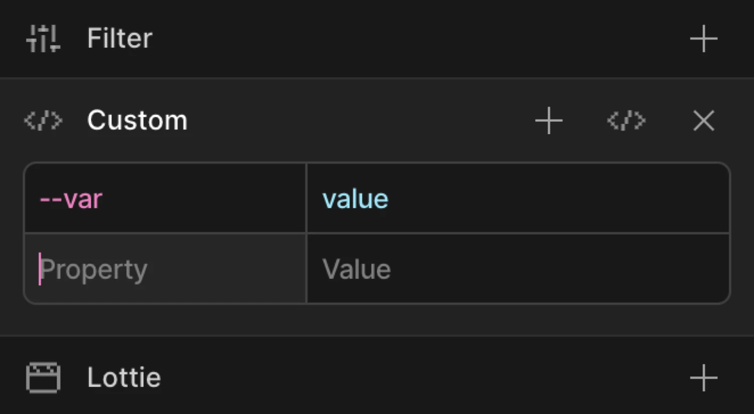
Controls
| Control | Description |
|---|---|
| Property input | The CSS property name. Accepts camelCase (borderRadius) or kebab-case (border-radius). |
| Value input | The target value for the property. Accepts any valid CSS value string or number. |
Add row button (+) |
Appends a new empty Property/Value row. Use this to animate multiple custom properties in one animation step. |
| Code field toggle | Switches the panel between Key/Value mode and Advanced Code Field mode. The icon is a </> code symbol. |
| Right-click context menu | Right-click any row in column view to Duplicate, Copy, Paste, or Delete row. The last remaining row cannot be deleted. |
Key/Value mode (default)
Each row has two inputs side by side:
- Property — the CSS property you want to animate, e.g.
border-radius,letter-spacing,padding-top - Value — the CSS value to animate to (or from), e.g.
50%,0.2em,24px
Use camelCase or kebab-case for the property name — both resolve correctly. When you enter a value that contains a cubic-bezier() expression or a four-number easing string, the builder normalises the decimal format automatically.
Click the + button in the panel header to append additional rows. Each row animates a separate CSS property within the same tween.
Advanced Code Field mode
Click the code field icon (the </> button) to switch to Advanced Code Field mode. Enter property/value pairs for the selected From, To or Set side, with or without outer braces:
y: 50,
'--Path-Margin': '-150%',
borderRadius: '12px',
x: Motion.utils.random(0, 100)
Values must be finite numbers or CSS strings. Expressions run once on the animated page when the animation is created or recreated, including in the preview. They do not run while you type or export. Advanced values override matching ordinary properties on the same side; other properties keep their values.
Treat expressions as trusted custom JavaScript: they run with the animated page’s privileges and are not sandboxed. Duplicate property names use the last supported value and show a diagnostic, including when different spellings normalize to the same name.
Quoted strings and ordinary template strings are escaped for inline script output without changing their values. HTML script delimiters inside tagged template text or regex literals are diagnosed rather than rewritten, because rewriting would change their raw text. Use a quoted string, an ordinary template, or new RegExp("pattern", "flags") instead.
Per-target functions such as x: () => 50, arrays, objects, computed keys and spreads are unsupported. Use the dedicated controls for animation options such as duration, ease and stagger. Invalid syntax and unsupported constructs show a message below the editor. Expressions that fail or return an unsupported value produce a browser-console warning and skip that property; other valid properties and animations still run. Your source text remains saved so you can correct it.
Use the Advanced Code Field when:
- You need to enter complex multi-value strings like
box-shadoworbackdrop-filter - You want to paste properties copied from existing SDK code
- You need to enter properties with special formatting that the row inputs make awkward
Switching modes preserves both your existing rows and Advanced source text. Click the code field icon again to toggle back to Key/Value mode. Stored advanced text only affects the animation while Advanced Code Field mode is enabled. Previously saved advanced text is preserved and included when you save/export the timeline again. WordPress MCP edits also retain active Advanced Custom fields, including responsive overrides, while the editor is closed. WordPress compiles the fields locally in PHP; their expressions run in the visitor’s browser when the animation is created.
From mode — animate from a custom value
Switch to the From tab, enable Custom, and add property/value pairs. The element starts at those values and animates to its natural CSS state.
Example: set border-radius to 0 on the From tab. If the element’s CSS has border-radius: 50%, it starts as a sharp square and morphs into a circle.
To mode — animate to a custom value
Switch to the To tab, enable Custom, and set the target property/value. The element starts at its natural CSS state and animates to the specified value.
Example: set border-radius to 50% on the To tab. The element morphs from whatever its CSS defines into a circle.
The box starts with border-radius: 0 (the From value) and animates to border-radius: 50% — a full circle.
SDK equivalent
Custom Properties map directly to any key-value pair in the from and to objects of the SDK.
Border-radius morph (From mode):
import { Motion } from '@motion.page/sdk';

Motion('circle-in', '.avatar', {
  from: { borderRadius: '0%' },
  to:   { borderRadius: '50%' },
  duration: 0.8,
  ease: 'power2.out',
}).onPageLoad();
Letter-spacing expand (To mode):
Motion('text-expand', '.headline', {
  to: { letterSpacing: '0.15em' },
  duration: 0.6,
  ease: 'power2.out',
}).onScroll({ scrub: true });
Multiple custom properties in one tween:
Motion('card-reveal', '.card', {
  from: {
    borderRadius: '4px',
    boxShadow: '0 0px 0px rgba(0,0,0,0)',
  },
  to: {
    borderRadius: '20px',
    boxShadow: '0 16px 40px rgba(0,0,0,0.18)',
  },
  duration: 0.5,
  ease: 'power2.out',
}).onHover({ each: true, onLeave: 'reverse' });
For the full SDK reference, see Custom Properties in the SDK.
Common patterns
Border-radius morph
Animate a sharp element into a pill or circle shape:
Motion('pill-in', '.button', {
  from: { borderRadius: '4px' },
  to:   { borderRadius: '999px' },
  duration: 0.5,
  ease: 'power2.inOut',
}).onHover({ each: true, onLeave: 'reverse' });
Letter-spacing expand on scroll
Widen letter-spacing as the element enters the viewport — a common typographic reveal:
Motion('type-reveal', '.tagline', {
  from: { letterSpacing: '-0.05em', opacity: 0 },
  duration: 0.9,
  ease: 'power3.out',
}).onScroll();
Padding push on hover
Animate padding to give a button a “breath” effect on hover:
Motion('btn-breathe', '.cta', {
  to: { paddingLeft: '32px', paddingRight: '32px' },
  duration: 0.25,
  ease: 'power1.out',
}).onHover({ each: true, onLeave: 'reverse' });
Box-shadow lift
Elevate a card with a growing shadow on scroll entry:
Motion('card-lift', '.card', {
  from: { boxShadow: '0 0px 0px rgba(0,0,0,0)' },
  to:   { boxShadow: '0 16px 40px rgba(0,0,0,0.15)' },
  duration: 0.6,
  ease: 'power2.out',
}).onScroll({ toggleActions: 'play none none reverse' });
For shadow interpolation to tween smoothly, keep the same number of shadow layers in both from and to. Mismatched layer counts cause a hard swap at the midpoint.
Related
- From, To & Set — How the three animation modes work and when to use each
- Custom Properties in the SDK — SDK reference for custom key-value animation pairs
- Filter — Animate blur, brightness, contrast, and other CSS filter functions
- Opacity — Animate element transparency with a dedicated slider