Workspace Overview
Tour of the builder interface — panels, preview, timeline, and navigation.
The Motion.page builder is split into four regions: a Top Panel toolbar, a Left Panel for configuration, a central Frame View with your live site preview, and a Timeline Editor at the bottom for arranging animation nodes.
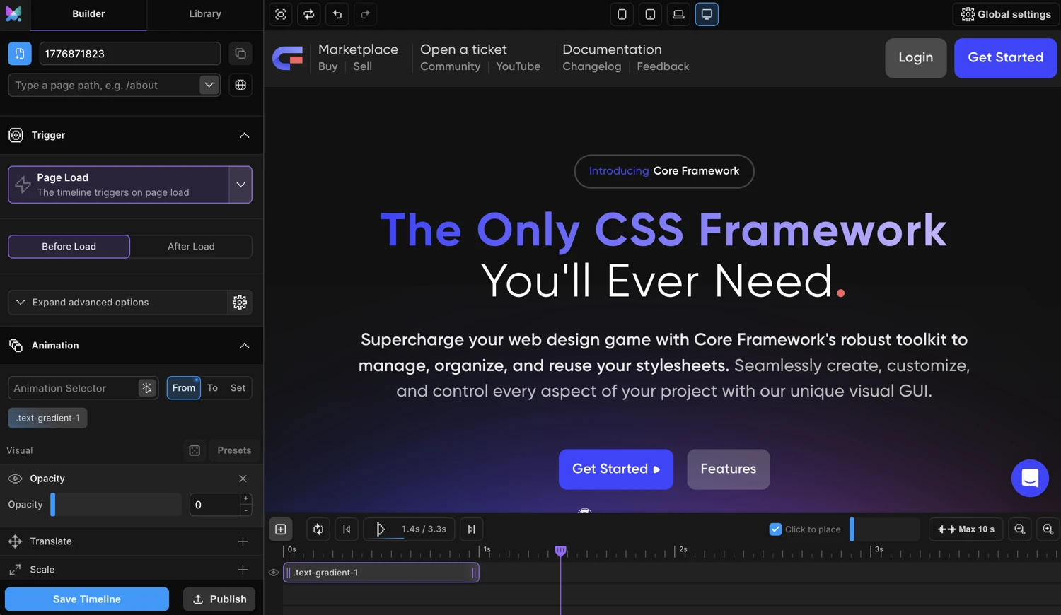
Top Panel
The Top Panel runs across the full width of the builder and holds global controls.

Left group — History & View
| Button | Shortcut | What it does |
|---|---|---|
| Fullscreen | — | Hides the Left Panel, expanding the preview to fill the full width |
| Refresh | — | Reloads the preview iframe with the current page |
| Undo | Ctrl+Z / Cmd+Z |
Undoes the last builder action |
| Redo | Ctrl+Shift+Z / Cmd+Shift+Z |
Redoes the last undone action |
Center — Device breakpoints
The four breakpoint buttons (Mobile, Tablet, Laptop, Desktop) set the preview iframe width to the corresponding pixel value defined in your site’s breakpoint settings. The active breakpoint is highlighted.
Use these to verify that your animation looks correct at each viewport size. The Breakpoints section in the Left Panel lets you enable or disable an animation for specific breakpoints.
Right — Global Settings
The cog icon opens the Global Settings fly-out panel. This is where you configure site-wide options: tooltip visibility, builder theme, CDN loading, Lenis smooth scroll, breakpoint widths, WordPress integration, and white-label settings.
Left Panel
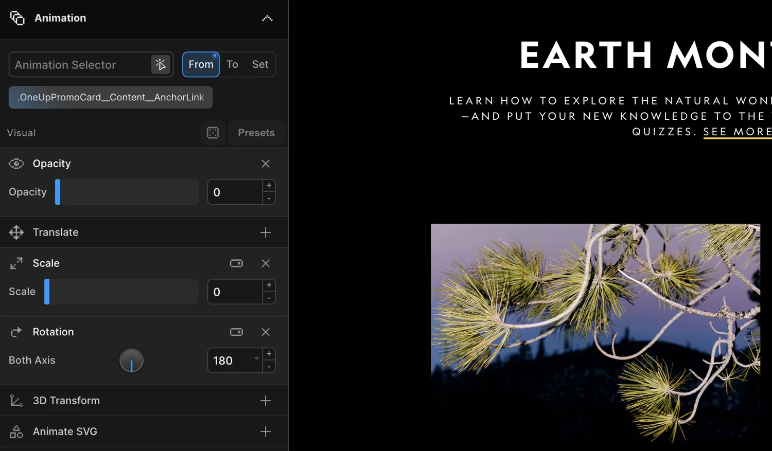
The Left Panel holds all animation and trigger configuration. It has three tabs at the top: Builder, Library, and Artifact (desktop only).
Navigation bar
The nav bar at the top of the Left Panel contains the Motion.page logo and the tab switcher.
- Logo — On the desktop app, clicking the logo opens the Project Dashboard.
- Builder tab — The main configuration view (described below).
- Library tab — Lists all saved timelines for the current site or project. Each item shows the timeline name, page, and trigger type, with actions to load, duplicate, or delete it. Use Refresh Library (in the footer) to sync after external changes.
- Artifact tab (desktop only) — For managing animation artifacts.
AnimationName section
At the top of the Builder tab:
| Control | What it does |
|---|---|
| New (+) | Creates a new timeline |
| Timeline name | Editable text input — rename the current timeline |
| Duplicate | Duplicates the current timeline |
| Page selector | Choose which page this animation loads on |
| Global toggle | When enabled, the timeline loads on every page of the site |
| Advanced Targeting | Collapsible section — filter by post type, category, or regex URL pattern |
Trigger section
The Trigger section defines what causes the animation to play. Choose a trigger type from the dropdown, then configure its settings:
| Trigger type | When it fires |
|---|---|
| Page Events | On page load or when the page is fully loaded |
| ScrollTrigger | As the user scrolls — supports scrub, toggle actions, pin, and markers |
| Interactions | On hover or click of a target element |
| Scroll | Smooth scroll / scrub driven by scroll position |
| Mouse Follower | Replaces the cursor with a custom animated element |
| Cursor Tooltip | Shows a tooltip that follows the cursor |
| Gesture | Responds to swipe and drag gestures via the SDK’s gesture engine |
Note: The Mouse Follower and Cursor Tooltip triggers hide the Timeline Editor — those animations are not time-based.
Animation section
The Animation section is where you define what gets animated and how.
- Selectors — One or more CSS selectors identifying the elements to animate. Click the scanner icon (Selector Detector) to pick elements interactively in the Frame View.
- FROM / TO / SET switcher — Controls the tween type:
- FROM — Properties define the starting state; elements animate from these values to their natural state.
- TO — Properties define the ending state; elements animate from their natural state to these values.
- SET — Zero-duration instant set. Immediately applies the properties without animation.
- Animation property panels — Collapsible sections for each property type: Translate, Rotation, Scale, Skew, Opacity, Filter, Dimensions, Border, Custom CSS, Ease, Repeat, Stagger, Transform Origin, 3D Transform, SVG Draw, Lottie, Class Manipulation, Text Splitter, Background Position, Image Sequence, Motion Path, and more.
- Presets — Quick-apply common animation patterns.
Tip: Right-click the FROM or TO button to reveal additional tween options.
Breakpoints section
The Breakpoints section lets you enable or disable this animation at specific viewport sizes. Useful for mobile-only or desktop-only effects.
Footer
The footer at the bottom of the Left Panel contains context-sensitive actions:
| Control | Available on | What it does |
|---|---|---|
| WP Dashboard | WordPress | Opens the WordPress admin dashboard |
| View Frontend | WordPress | Opens the live frontend in a new tab |
| Open in Oxygen / Bricks | WordPress (if applicable) | Jumps to the page editor |
| Save Timeline | All | Saves the current timeline. Shortcut: Ctrl+S / Cmd+S |
| Publish | Desktop | Publishes the timeline to the Convex backend |
| Refresh Library | Library tab | Re-fetches all library items |
| Save Artifact | Artifact tab | Saves the current artifact |
Frame View
The Frame View is the central region — a live preview of your website rendered inside an iframe (or an Electron webview on the desktop app).
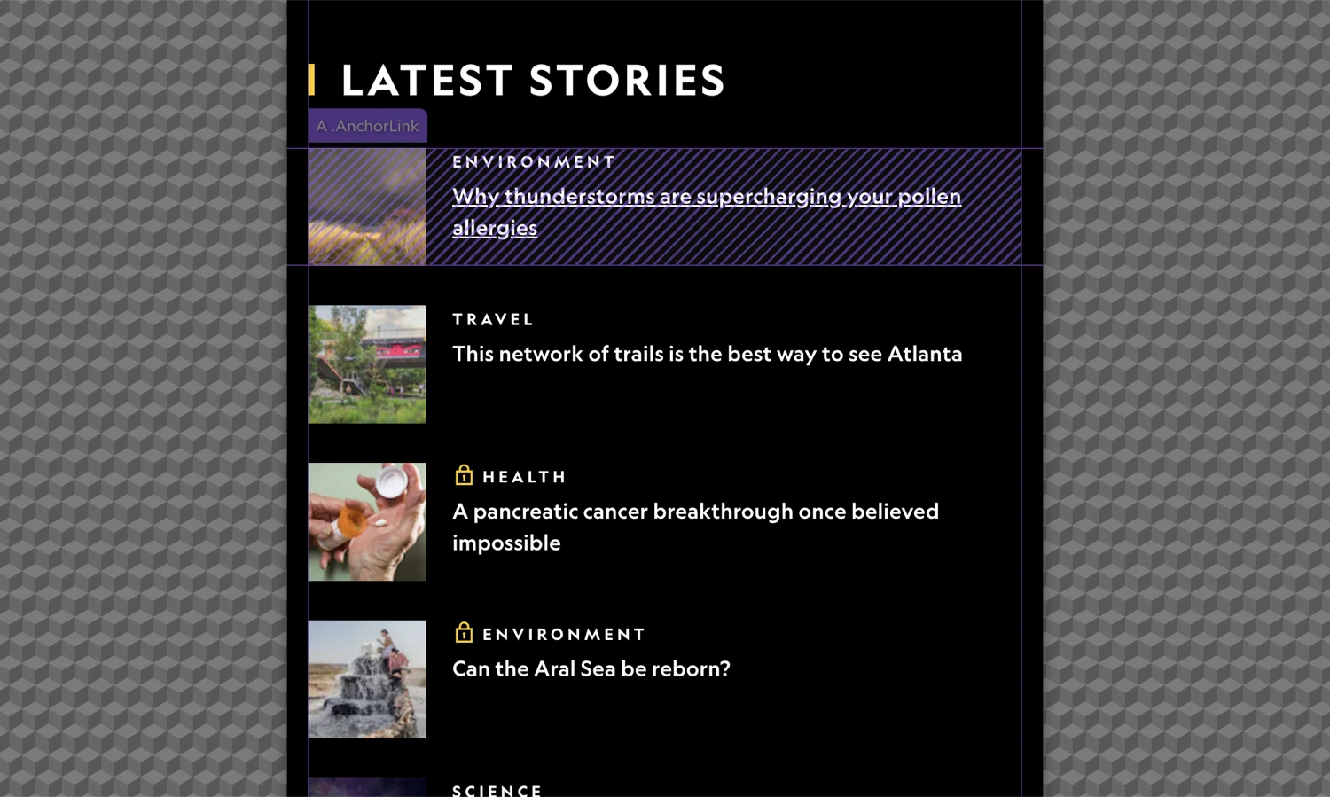
- The preview width is controlled by the breakpoint buttons in the Top Panel. When the iframe is narrower than the full container, a checkered pattern fills the side gutters.
- Element selection — With the Selector Detector enabled in the Animation section, clicking any element in the Frame View inserts its CSS selector into the selectors field.
- Live preview — Animations play directly inside the preview iframe. Enable Live mode in the Timeline Editor to preview scroll, hover, and click triggers in real time without leaving the builder.
Timeline Editor
The Timeline Editor sits at the bottom of the workspace. It is a horizontally scrollable track where each animation node is a draggable, resizable block. Drag the top edge of the panel to resize it vertically.
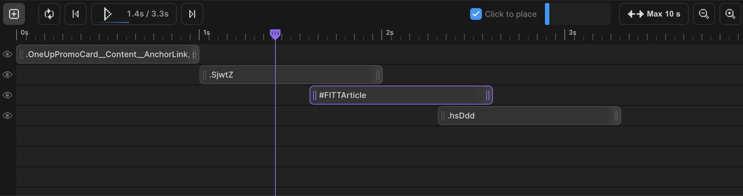
Playback controls
| Control | Shortcut | What it does |
|---|---|---|
| Add Node (+) | — | Adds a new animation node to the timeline |
| Loop | — | Loops playback continuously for preview |
| Jump to Start | — | Moves the playhead to 0s |
| Play / Pause | — | Plays or pauses timeline playback. Shows current time and total duration (e.g. 0.4s / 2.0s) |
| Jump to End | — | Moves the playhead to the last node’s end time |
| Live | — | Executes animations live on the page, synced to the trigger (scroll, hover, click) |
| Click to place | — | When checked, clicking on the timeline track places a new node at that position |
Timeline view controls
| Control | What it does |
|---|---|
| Timeline scrollbar | Scrolls the timeline horizontally when nodes extend past the visible area |
| Max duration | Sets the maximum visible duration (10s → 20s → … → 70s). Click and drag to adjust. |
| Zoom Out / Zoom In | Changes the horizontal zoom level of the timeline |
Working with nodes
Each node on the timeline represents one animation on one set of elements:
- Drag a node to change its start time.
- Resize from either edge to change its duration.
- Click a node to select it — the Left Panel updates to show that node’s animation properties.
The ruler at the top of the timeline shows time in seconds, updating dynamically as you zoom.
How the panels work together
The four regions are tightly connected:
- Enter a CSS selector in the Left Panel → Animation section, or click an element in the Frame View with the Selector Detector active.
- Configure the animation — set FROM/TO/SET and add property panels in the Left Panel.
- See the node appear (or add one manually with +) in the Timeline Editor. Drag it to set the start time and resize it to set the duration.
- Press Play in the Timeline Editor to preview the result directly in the Frame View.
- Save with
Ctrl+S/Cmd+Swhen done.
Next steps
- Left Panel — Detailed reference for every control in the configuration panel
- Timeline Editor — Node management, scrubbing, and playback options
- Scroll Trigger — Scroll-based triggers and their settings
- From, To & Set — Every animatable property explained