Fit Animation
Morph one element's position and size to match another element on the page.
Fit animates a source element’s position and size so it morphs to match a target element anywhere on the page — a declarative layout transition powered by the SDK’s Fit engine. Use it for expanding cards, tab indicators, thumbnail-to-lightbox reveals, and any animation where one element needs to travel toward another’s geometry.
Location
Left Panel → Animation tab → Functional Properties → Fit
Fit is a functional property — it is direction-agnostic and lives in the FUNCTIONAL_MAPPING_FT and ROOT_LEVEL_FUNCTIONAL sections of the animation config. The internal data key is fit. Enabling it on any tab (From, To, or Set) applies it globally to the animation node.
Enable Fit
Click the toggle next to Fit to enable it. The row expands to reveal the Target Selector, Ease, Absolute, and Scale controls. The source element is the one selected in the canvas; the target element is whatever you point the selector at.
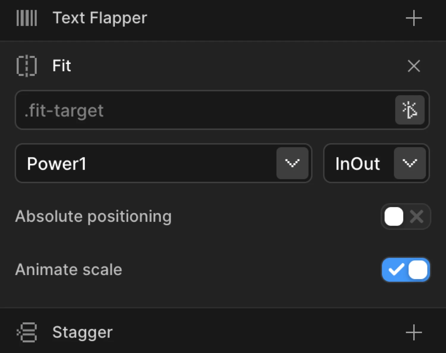
Controls
| Control | Type | Default | Description |
|---|---|---|---|
| Target Selector | Text input | (empty) | CSS selector for the target element whose position and size the source element will animate toward. Accepts any valid selector: #id, .class, [data-attr]. |
| Ease | Dropdown | (inherit) | Controls the acceleration and deceleration of the Fit animation. Overrides the node’s global ease for the Fit transition specifically. |
| Absolute | Toggle | Off | Switches the element to position: absolute during the animation. Prevents layout shifts and improves GPU-compositing performance on large reflows. |
| Scale | Toggle | On | Includes scale transformations in the Fit animation. Disable this for position-only animations where you want the element to move but keep its original dimensions. |
Target Selector tip: The selector is evaluated at animation time with
document.querySelector. Use the most specific selector possible to avoid ambiguity. If the target doesn’t exist on the page at animation time, the Fit step is skipped.
How it works
When a Fit animation plays, Motion.page captures the source element’s current geometry (position and size) and the target element’s geometry using the SDK’s Fit engine. It then animates the source from its natural state toward the target’s bounding rectangle — moving it across the page and resizing it simultaneously in a single, GPU-friendly tween.
The key difference from a standard Translate + Scale combo is that Fit measures real DOM positions at runtime. You don’t hard-code pixel values — it calculates everything from the actual layout, so it adapts to different screen sizes and dynamic content automatically.
What gets animated:
x/yposition delta between source and target- Width and height (as scale transforms by default)
Under the hood: The SDK’s Fit utility is used to calculate and apply the transform. The element is briefly captured in its natural state, the transform is computed, and then the SDK animates it to the target geometry over the animation’s duration.
Typical use cases:
- Expanding card → full-screen overlay — a card grows and repositions to fill the viewport
- Tab indicator — a highlight pill slides and resizes between tab labels
- Image gallery — a thumbnail morphs into a full-size lightbox image
The purple Card box morphs in position and size toward the dashed Hero area. This mirrors how Fit works in the builder — the source element animates toward the target’s bounding rectangle at runtime.
Common patterns
Expanding card to full-screen overlay
Select the card element. Enable Fit, set Target Selector to #overlay (or any full-screen container). Enable Absolute to pull the card out of flow during the animation. Set Scale on. Combine with Opacity on a To tab to reveal the overlay content as the card expands.
import { Motion } from '@motion.page/sdk';

Motion('card-expand', '.card', {
  fit: {
    target: '#overlay',
    absolute: true,
    scale: true,
  },
  duration: 0.6,
  ease: 'power3.inOut',
}).onClick();
Tab indicator sliding between tabs
Select the indicator <span>. Enable Fit, point Target Selector at the active tab’s [data-tab].active element. Disable Scale so the indicator keeps its original height — only position animates. Use a short duration (0.3 s) with power2.out.
Motion('tab-indicator', '.tab-indicator', {
  fit: {
    target: '[data-tab].active',
    scale: false,
    absolute: false,
  },
  duration: 0.3,
  ease: 'power2.out',
}).onClick();
Image gallery — thumbnail to lightbox
Select the thumbnail <img>. Enable Fit, set Target Selector to #lightbox-image. Enable Absolute and Scale. This produces the thumbnail flying across and growing into the lightbox frame before the full image loads.
Motion('thumb-to-lightbox', '.gallery-thumb', {
  fit: {
    target: '#lightbox-image',
    absolute: true,
    scale: true,
  },
  duration: 0.55,
  ease: 'expo.inOut',
}).onClick();
SDK equivalent
In the SDK, Fit is configured via the fit object on any animation node. All builder toggles map directly to properties.
import { Motion } from '@motion.page/sdk';

// Full Fit config
Motion('hero-fit', '.source-card', {
  fit: {
    target: '#target-hero',   // CSS selector
    absolute: true,            // position:absolute during tween
    scale: true,               // include scale transforms
  },
  ease: 'power3.inOut',
  duration: 0.65,
}).onPageLoad();
For the full SDK reference, see Fit Animation in the SDK.
Tips
- Use Absolute for reflow-heavy layouts. If the source element participates in flexbox or grid,
position: absoluteduring the tween prevents sibling elements from jumping around while the animation plays. - Scale off = position only. If your source and target are the same size (e.g. a tab indicator), disable Scale so the SDK doesn’t try to apply dimension transforms that would distort the element.
- Target must exist at playback time. If the target element is conditionally rendered (e.g. inside a hidden modal), make sure it’s in the DOM before the animation fires. Use a Click or Hover trigger on the element that reveals it, then chain the Fit animation after.
- Test at multiple breakpoints. Fit measures live DOM positions — make sure the target element exists and is visible at every breakpoint where the animation can fire.
Related
- From, To & Set — How functional properties apply across animation mode tabs
- Translate — Animating position without a target element
- Scale — Animating dimensions independently
- Easing — All available ease curves for Fit and other properties
- Click Trigger — Common trigger for Fit-based interactions