Scroll Trigger
Set up scroll-based animations with start/end positions, scrub, toggle actions, pinning, and per-element iteration.
See it live ScrollTrigger feature pageThe Scroll Trigger plays or scrubs a timeline based on scroll position. It is gives you precise control over when an animation starts, when it ends, how it reacts to scrolling back up, and whether it pins an element in place.
Location
Left Panel → Trigger tab → trigger type dropdown → Scroll
When Scroll is selected, the builder enters Live Play mode and shows viewport markers in the Frame View automatically. These markers show exactly where the start and end scroll positions fall — they are always visible while you configure the trigger.
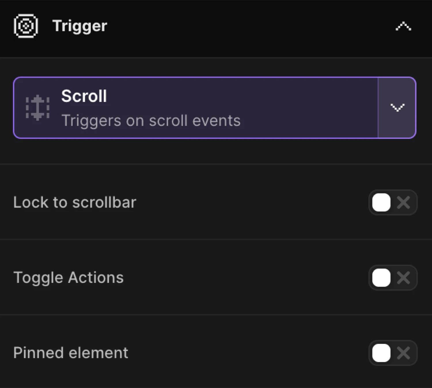
Lock to scrollbar
Lock to scrollbar (isScrub) links animation progress directly to the scroll position. The animation plays forward as the user scrolls down and reverses as they scroll up — it never plays on its own.
Sync animation progress with the scrollbar.
| Control | Default | Description |
|---|---|---|
| Lock to scrollbar toggle | off | Enables scrub mode — animation progress is driven by scroll position. |
| Delay slider | 1s |
Adds inertia so the animation takes time to catch up to the scrollbar. 0 = instant sync. Range: 0–8 s. Double-click to reset to 1. |
Soften the link between the scrollbar and the animation, so it takes a certain time for the animation to ‘catch up’ the scrollbar.
When Lock to scrollbar is on, Toggle Actions and Timeline repeat are hidden — they are incompatible with scrub mode.
Toggle Actions
Toggle Actions (toggleActions) defines how the animation responds at each of its four lifecycle stages: on enter, on leave, on enter back, and on leave back. Only available when Lock to scrollbar is off.
Control the playback of your timeline during these 4 stages — On enter, on leave, on enter back, on leave back.
Enable the toggle to reveal a creatable, searchable dropdown (toggleActionsValue). Choose a preset or type a custom string of four space-separated keywords.
Choose from the premade list or write down your own using these keywords: play, pause, resume, reset, restart, complete, reverse and none. E.g.
play pause resume reset
Presets
| Label | Value |
|---|---|
| Play only once on scroll down | play none none none |
| Repeat on every scroll down | restart none none none |
| Restart on scroll back | restart none restart none |
| Reverse on scroll back | play none reverse none |
| Reverse on scroll back leave | play none none reverse |
| Always reverse on scroll backwards | play reverse play reverse |
The four positions map to: onEnter onLeave onEnterBack onLeaveBack. Valid keywords: play, pause, resume, reset, restart, complete, reverse, none.
Pinned element
Pinned element (isPin) fixes an element in place between two scroll positions while the animation plays.
Fix an element in place between certain scrolling positions. Use the element start / end selector to define pinned content, and use Scroller range to increase the scrolling duration.
Enable the toggle to reveal two sub-controls:
| Control | Default | Description |
|---|---|---|
| Pin Selector input | (empty) | CSS selector for the element to pin. Leave empty to pin the first animated element (pin: true). |
| Add spacing dropdown | Auto |
Controls spacing below the pinned element while it is fixed. |
Add spacing options
Push other elements down, while a content is pinned by adding a padding or margin.
| Builder option | SDK value | Behaviour |
|---|---|---|
Margin |
pinSpacing: "margin" |
Adds margin to push content below the pin. |
Padding |
pinSpacing: "padding" |
Adds padding instead of margin. |
No spacing |
pinSpacing: false |
No extra space — content may overlap during the pin. |
Auto |
(not set) | The SDK chooses the default spacing behaviour. |
Trigger each iteration individually
Trigger each iteration individually (multiple) animates each matched element with its own independent scroll trigger instance.
By enabling this option, you can animate each iteration of the class individually one-by-one.
Maps to each: true in the SDK. When enabled, the position labels in the Start and End blocks change from “First element’s” to “Each element’s” — each element’s own bounding box is used to compute trigger positions.
Start position
The Starts When block defines when the animation begins. It reads as: “[element position] reaches [viewport position].”
The animation starts / ends when selected position of the element reaches certain part of the viewport. By using ‘selector’ option, you can wrap the element used in from / to properties with a parent element and use it as a trigger.
Element / Selector
| Option | Behaviour |
|---|---|
| Element | Uses the first animated element (or each element if Trigger each is on) as the scroll trigger. |
| Selector | Shows a CSS selector input. The element at that selector is used as the trigger instead. Switching to Selector also switches the End block to Selector. |
Element position
Click the top / center / bottom icon picker to choose which edge or midpoint of the trigger element is measured.
| Icon | Value | Meaning |
|---|---|---|
| Top icon | top |
Element’s top edge |
| Center icon | center |
Element’s vertical midpoint |
| Bottom icon | bottom |
Element’s bottom edge |
Reaches (viewport position)
The Reaches slider sets the vertical position in the viewport where the element position must arrive to fire the trigger.
| Setting | Default | Range | Description |
|---|---|---|---|
start.offset_vw |
85% |
−100% to 100% / −1000 px to 1000 px | Position from the top of the viewport. 85% = near the bottom edge. |
Toggle the unit button to switch between % and px.
Default start: "top 85%" — the element’s top edge enters at 85% from the viewport top, meaning it just appears from the bottom.
Offset (element offset)
Click the + button (tooltip: Add a positive or negative offset to the element’s trigger) to reveal the Offset slider. This nudges the trigger position by a fixed amount on top of the element’s edge.
| Setting | Default | Range | Description |
|---|---|---|---|
start.offset |
0 |
−100% to 100% / −1000 px to 1000 px | Shifts the effective start point up (negative) or down (positive). |
Enable clamp
This makes sure the value stays between 0 (the page’s top) and the furthest scroll point. This way, the value won’t go beyond the page’s limits and the page’s won’t have animations that only play halfway.
Toggle Enable clamp (start.clamp) to prevent the trigger from firing at a scroll position outside the page boundaries. Useful for elements near the very top or bottom of the page.
End position
The Ends When block defines when the animation ends. It has all the same controls as Start, plus one extra option at the top: Relative to start.
Default end: "bottom 15%" — the element’s bottom edge reaches 15% from the viewport top, meaning it is near the top of the viewport.
Relative to start
Enable Relative to start (end.useRelative) to express the end position as a distance offset from the start, rather than an absolute viewport position.
When enabled the standard position controls are replaced by a Distance slider:
| Setting | Default | Range | Description |
|---|---|---|---|
end.relativeValue |
100 |
0–1000% / 0–5000 px | How far past the start point the animation should end. |
Toggle the unit button to switch between % and px. The SDK receives this as end: "+=100%" or end: "+=300px".
End selector
When Selector mode is active on the End block, a separate end trigger selector input appears (scrollTrigger.endTrigger). This lets a different element define the end boundary from the one used for the start.
Custom code
The Custom code section is a collapsible field that accepts any valid ScrollTrigger configuration as raw key/value pairs. Use it to access scroll trigger options that are not exposed in the visual UI.
Click Custom code to expand the field. When the section is collapsed and contains code, a dot indicator marks it as active.
Advanced Options
The Advanced Options section is collapsible and contains lower-level settings.
Bypass ‘prefers-reduced-motion’
‘prefers-reduced-motion’ is a browser accessibility feature that prevents animations to run. You can bypass it by using this option, if necessary.
Disabled by default. Enable only when the animation is purely decorative and safe to show regardless of the user’s motion preference.
Scroller is based on
The animation starts when Scroller Start meets the animation element.
| Option | SDK | Description |
|---|---|---|
| Viewport | (not set) | Default — the browser viewport is the scroll container. |
| Selector | scroller: ".container" |
A custom scrollable element is used as the container. Shows a CSS selector input when selected. |
Timeline repeat
Only available when Lock to scrollbar is off. Enable to loop the animation within the scroll trigger range.
Apply repeat to the entire timeline.
| Control | Default | Description |
|---|---|---|
| Repeat | -1 |
Number of additional plays. -1 = infinite. |
| Delay | 0 |
Seconds between each repeat cycle. |
| Enable YoYo | off | The timeline plays forward then backward on alternate cycles. |
Yoyo causes the timeline to go back and forth on repeat.
When Lock to scrollbar is on, this section shows the notice: “Timeline repeat will not work with lock to scrollbar.”
In the builder this is a From animation with opacity: 0 and y: 24, with the default start position of "top 85%".
SDK equivalent
The builder Scroll trigger maps to .scrollTrigger() in the SDK.
import { Motion } from "@motion.page/sdk";

// Default — animate in as element enters viewport
Motion("fade-in", ".card", {
  from: { opacity: 0, y: 24 },
  duration: 0.6,
  ease: "power2.out",
}).scrollTrigger({
  start: "top 85%",
  end: "bottom 15%",
  toggleActions: "play none none none",
});
Scrub — link animation progress to scroll:
Motion("parallax", ".hero-image", {
  to: { y: -80 },
}).scrollTrigger({
  start: "top top",
  end: "bottom top",
  scrub: 1,
});
Pinned section:
Motion("pin-section", ".panel", {
  from: { opacity: 0 },
  duration: 1,
}).scrollTrigger({
  start: "top top",
  end: "+=100%",
  pin: true,
  scrub: true,
});
Per-element triggering:
// Each .item gets its own scroll trigger
Motion("list-reveal", ".item", {
  from: { opacity: 0, y: 20 },
  duration: 0.5,
  ease: "power2.out",
}).scrollTrigger({
  start: "top 85%",
  each: true,
  toggleActions: "play none none none",
});
Custom scroller container:
Motion("inner-scroll", ".content", {
  from: { opacity: 0 },
  duration: 0.4,
}).scrollTrigger({
  start: "top 80%",
  scroller: ".scroll-container",
});
For the full SDK reference see Scroll Trigger and Scroll Trigger Advanced.
Common patterns
Fade in on enter, no reverse
Use the Play only once on scroll down toggle actions preset (play none none none). The animation fires once when the element enters and stays in its end state even when scrolled back past.
Parallax background
Enable Lock to scrollbar and set a y translate on a background image. Set the start to "top bottom" and end to "bottom top" so the motion covers the full time the section is visible. Use a Delay of 0 for instant sync.
Sticky storytelling section
Enable Pinned element, leave the pin selector empty (pins the first animated element), and set a Relative to start distance on the end position (e.g. 300%) to keep the element pinned for three viewport-heights of scrolling.
Reveal each list item individually
Enable Trigger each iteration individually. Every element matching the selector gets its own trigger instance — items reveal one by one as the user scrolls, not all at once.
Related
- Scroll Trigger — SDK reference —
scrollTrigger()API and options - Scroll Trigger Advanced — SDK reference — Pin, snap, and advanced ScrollTrigger features
- Page Load Trigger — Auto-play animations when the page loads
- Hover Trigger — Trigger animations on pointer enter
- Click Trigger — Trigger animations on element click
- Left Panel — Full Left Panel reference including the Trigger tab