How To Animate a Full-Screen Menu Using Motion.page
Introduction
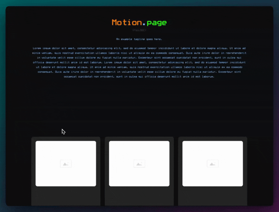
This tutorial demonstrates how to create an expanding header with a curtain effect in Oxygen Builder. The effect includes a clickable icon that transforms into a cross, revealing menu items in a curtain-like dropdown.
Steps
- Setting Up the Header:
- Use Oxygen Builder to create a header using a div, positioning it at the top with padding.
- Add a logo on the left and a hamburger icon on the right, wrapped in a div.
- Configuring the Hamburger Icon:
- Assign IDs 'open' and 'close' to the hamburger and cross icons, respectively.
- Set the initial state of the 'close' icon to have an opacity of zero.
- Apply a 'menu trigger' class to both icons and adjust the Z-index to ensure they are at the front.
- Creating the Curtain Effect:
- Add a fixed-position grid div under the header, named 'curtain'.
- Set the initial height of the curtain to zero and change the background color.
- Duplicate the curtain div four times to create multiple layers.
- Adding Menu Elements:
- Create a fixed-position div for menu elements, ensuring it spans the entire screen.
- Add text links for menu items, setting their color to white and adjusting typography.
- Animating in Motion Page:
- In Motion Page, create a new timeline named 'menu trigger'.
- Target the 'menu trigger' class for the open and close icons, adjusting their opacity for the transition.
- Animate the curtain divs to change height and stagger their appearance.
- Adjust the background color transition of the curtains.
- Target the menu elements, setting their initial opacity to zero and animating them to fade in.
- Final Adjustments:
- Apply translation animations to the menu items for a smoother effect.
- Adjust the stagger timing and ease settings for a snappier animation.
- In Oxygen Builder, add custom CSS for a pointer cursor on the menu items.
Conclusion
This tutorial provides a comprehensive guide on creating an interactive, expanding header with a curtain effect in Oxygen Builder. The process involves setting up the header, configuring icons, creating the curtain effect, adding menu elements, and animating everything in Motion Page. This effect is suitable for enhancing the visual appeal and user experience of a website's navigation.
Video transcript
Hello guys, Luke here with Motion Page, back with another tutorial today. In today's tutorial, I want to show you how you can create something like this. So the main focus is this header here, and what I want to show you how to make is when you click on this here, you get this nice effect, kind of like a curtain effect which comes down with your menu items. This also changes to a cross as you can see, very basic, it's nothing too special. So without my talking, let me just show you how to make this.
Okay, so once again, I'll be using Oxygen Builder for this, and I'm just going to open up my main template over here. In the meantime, I'm also going to grab a logo from Logo Ipsum. I think I'll just use this one here. Okay, so first, let's set up our header. I'm just going to use a div for this, put this to the top, call it 'header,' put some padding on there, and I want to do horizontal middle and space between.
The first element is going to be our logo on the left side, and then on the right side, we want our hamburger icon. I'm going to use this one for now. I want to wrap this in a div, so I'll show you why I'm doing this in a second. This icon, I'm going to change to 'menu open.' I'm also going to give it an ID, 'open.' I'll duplicate this one; it will be 'menu close.' On the container, I'm just going to do 'relative' here, and then the close, let's do 'absolute,' also give it an ID, 'close.'
Okay, and let's change the actual icon then, like that. Okay, cool. Now, on initial states, the close, I want this to have an opacity of zero. And one last thing is I'm going to give these a class, and these will be triggers, so 'menu trigger,' and this will also be a trigger. So that's that. I think also we'll change the Z index on this so that it's at the front. I'll just do something like 500 there, alright?
So that's our main header. Next, we want to work on our fixed element, which will be spanning across the whole page. Let's make that now. So I'm going to put this underneath the header here, 'expanded header,' this wants to be a grid, and I want to give it a grid with four columns, so to do this, I'm just going to go to the custom CSS, and we'll just do, I'll wait for the 100 as well. Okay, so now if I put a div inside here, it should take up, yeah, that's perfect.
Before I continue editing that, I'm just going to call this 'curtain,' and I want to position this fixed, so let's see layout, a position fixed, and this one's took the up at the very top, left and right like that, okay? 'Curtain,' I'm gonna give this a class, 'menu curtain,' and then in here, I want to give it a height, viewport height of zero on its initial state, and then in Motion Page, we can Target this class for each of them, and we'll change the Heights, and then we'll stagger them as well.
Alright, so before I continue, let's just change the background color of this, that. And now I'm going to duplicate this four times, cool. Next, we need our actual elements that are going to sit inside. We can actually just create another element under the div here, and I'm actually going to put this inside, just below the curtains, called 'menu elements.' I want this to also be 'position fixed,' so we'll go layout and 'fixed' like that. This time, it's gonna span the whole screen like that.
I'm going to position the elements like this, so everything is in the center. And now in here, I'm just going to do 'text link,' and these will be our menu links. Text color is going to be white. I also want to change the typography, so let's just add a class to this, so instead of doing it on the ID, let's do 'menu item,' get white typography. We'll go with something like '3 REM,' and just so I can see everything here, I'm just going to change the Z index on this, '50,' just so I can see. And this is going to be called 'home,' and then once again on here, let's just do 'uppercase.' Something like '700,' 'products.' Let's do, let's just do 'followings' for now, and let's change this to 'contact us.'
So as you can see at the moment on the front end, if I save this, we have a big issue, of course. So these are visible and clickable, which is not good. So let's fix that now. So all I'm going to do is, we can fix this in Motion Page actually. So let's head on over to Motion Page now, and I'll show you how you can fix this. So I'm just going to save this and then let's go to Motion Page. So I'm going to create a new timeline. I'm going to call this 'menu trigger'.
I want to make sure this is checked just in case we do want it to happen on every page. I'm going to change the trigger here to click. And first of all, what we want to Target here is our 'menu trigger' class that we created, and remember that's applied to both the open one and close, and now we can create our animations.
So first, let's work on this icon here. I'm going to Target first 'menu open icon.' So once this has been clicked on, I want to change the opacity to zero. But at the same time, so if I duplicate this, we can now Target the 'menu close icon,' 'menu close,' and then this opacity wants to become one, and we can make that happen just a little bit after this one fades out. So you can see that happening there on the timeline in the top right. The icon's changing a little overlap, something like that. Okay, next, I want to Target our curtains. So when we click on this, we want the curtains to come down. So let's go back here and our curtains, 'menu curtain,' so let's target that one, 'menu curtain.'
So that's working; you can see it's selecting right at the top left there. It's a little bit difficult to see. What we want to happen when we click on this, we want it to keep the same 'from,' but on 'to,' we want to change the height dimension or height to 100. So let's just see. So you can see they're all coming down, which is good, but we want to stagger those. All we need to do for that is just go down here, stagger. I'm going to do, I'm going to change it to 'amount,' it's the total, and then we'll do like 0.3 seconds. So it's quite fast, staggering quite nicely.
Next, I actually want it to change color a little bit. I want it to go from a white color background to a color here. So let me just grab this. Cool. All right, that's nice. I'm going to save this for now. Next, what I want, we need to fix these menu items here first of all. So let's do that. Let's target those. 'Menu elements,' here, 'text links.' Okay, so I'm just going to give this an ID, 'elements,' like that. And now what I can do in Motion Page is use that selector.
Okay, so I just needed to refresh my page here, but this selector is working. So now it should, yeah, you can see it's fading. So if I put this forward a little bit, you can see now it has an opacity of zero and then it fades in like that using the selector. Yeah, I'm just going to save this, see what it looks like on the front. Excellent.
Okay, so next, what I want to do is just give them a slight animation. So I want them to translate from, let's use pixels here, we'll do like minus 100 pixels to zero, like that. Let's make sure this is one as well, so we can see it. And then let's also stagger those. So we'll stagger each one by 0.2 seconds, something like that. So as that comes down, so do the elements. That's a little bit too long, actually. I'm just going to put this here. Then I'm going to change amount, 0.3. It's a little bit quicker, snappier like that. Okay, see, click on this. Nice. Cool. I think one more thing I want to do is just change the 'Ease' on this to something like 'power.' So it's very snappy, and they will do the same on this one.
And then in Oxygen, I'm just going to apply something to this, and I want to do custom CSS. We'll do 'cursor pointer.' Cool. So there you have it, guys. There's the header, and this should also work on mobile because we are using a grid or whatever size I use; it should always look pretty good.
Of course, feel free to change the color of your icons here and the sizing so that they both match, but this is just an example showing you how you can create something like this. So there you have it, guys, just another basic tutorial today on how to create that expanding header. If you do like the video, please consider giving it a thumbs up, and please do subscribe; it will help our Channel a lot. We will be bringing more content like this every Monday. I'll see you next time. Thank you.