Animate your Timelines using Motion.page and GSAP! 🎉🙌🏻
Introduction
Luke Allen presents a user-requested tutorial on creating an animated timeline in Oxygen Builder using Motion.page. The focus is on creating a timeline with cards and a central line that fills up with color as the user scrolls down.
Steps
- Initial Page Setup:
- Start with a new page in Oxygen Builder, using a template for speed.
- The page layout includes three columns (45% - 10% - 45% width) with divs inside.
- Configuring the Middle Column:
- The middle column contains an icon and a div acting as a line (initially set to 2 pixels wide, changed to 5 pixels for visibility).
- The line div is adjusted to have a height of 100% and sits under the icon.
- Creating the Progress Bar:
- Add a new div inside the line div, named 'progress bar'.
- Set the progress bar's height to 0% and width to match the line div (5 pixels).
- Duplicate this setup for each section of the timeline.
- Adjusting Colors and Icons:
- Change the icons' background color to light gray and the progress bar's color to primary blue.
- Ensure the progress bar is behind the icon in the layout.
- Setting Up Animations in Motion.page:
- Create a new timeline named 'animated timeline'.
- Set a scroll trigger to animate the progress bar's height from 0% to 100%.
- Adjust the trigger for each iteration of the class to animate independently.
- Animating the Icons and Cards:
- Add a new animation node to change the icons' color to blue as the progress bar fills.
- Animate the cards to translate and fade in as the user scrolls down.
- For a more aligned effect, adjust the translation distance and opacity settings.
- Refining the Animation with Left and Right Classes:
- Add unique classes to the cards on the left ('timeline left card') and right ('timeline right card').
- Animate the left cards to come in from the left and the right cards from the right, using the X-axis for translation.
- Finalizing and Testing the Animation:
- Save the changes and test the animation on the front end.
- Ensure smooth transitions and color changes as the user scrolls through the timeline.
Conclusion
This tutorial demonstrates how to create an engaging animated timeline in Oxygen Builder with scroll-triggered animations using Motion.page. The effect includes cards animating into view and a central line that fills up with color, adding a dynamic and visually appealing element to the webpage. The tutorial is suitable for users looking to add interactive and animated timelines to their websites.
Video transcript
[Music]
Hello guys, welcome back to the channel. Luke here with Motion Page. In today's video, this is a user-requested tutorial which was requested in our community. Basically, it is an animated timeline. Here's what it looks like. As you can see, this is the example that was posted in the requests. As I scroll down, you'll see that first of all, the cards animate in like this. But you'll also see the line in the center, it kind of fills up with a pink color as you scroll down, which is quite nice.
Now, I'm not sure how they've created this one exactly. I don't think this is Gap, but we will be using Motion Page for this. It might look a little bit different, but essentially we'll be creating something very similar. Now, I do just want to point out that I will be using an Oxygen template to create this. This is just going to make it faster for me. The main purpose of this video is the animation itself and not design, but I will show you how the design is set up in a basic way, but I'm not going to go into too much detail with that.
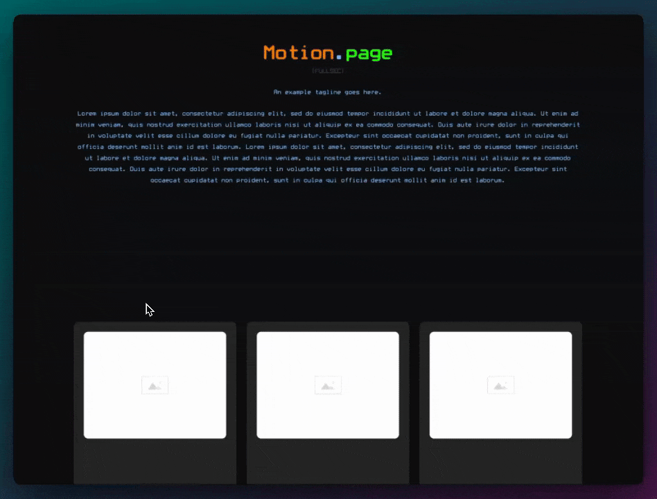
Alright, so as you can see, I've just created a new page here called "timeline" and I'm going to edit with Oxygen. So here's my page, and like I said, I'm just going to use a template here, design set, which is, I believe, automatic. And there should be a page in here which has kind of like a timeline already. So it's this one. So if you're using Oxygen, you can simply import this one.
So let me show you how this is made. First of all, in case you're using a different builder, what we have is basically we have three columns here. It contains three divs inside, and then each div, so the left div is, I think it's 45% yeah, so it's 45% width. The middle one here has a width of 10%, and then the right one also is 45%. Okay, it's 45%, 10%, 45%. And then within each div, we have just some content here. This is a card. This card has a class applied to it already, so make sure you apply a class to this card because we can use this class to animate.
The center div here, so let's have a look. This also has a class called "middle column". And as you can see, it's using Flex, column, and then everything is centered and then to the top. So inside this div, we have an icon, as you can see, that goes to the top because the parent is set to the top on vertical alignment. And then under that, we have a div. Now this div, once again, I'll show you the ID first. It has a width of two pixels. I'm actually going to change this today to five pixels. And then on the class, it also has a height of 100%, just so it spans the whole height, and it's going under the icon. The icon is sitting on top.
So let's just make sure in here, let's have a look at custom CSS. Yeah, so the icon is on top because the Zed index is 100. So keep that in mind as well if you want to create a similar layout. But like I said, I'm not going to go into too much detail, but I hope this gives you enough understanding on how to create this kind of setup.
So first things first, I'm just going to make a couple of changes to this. I first of all want this line to be a little bit wider, so I'm just going to target this, and then on the ID, I'm going to change everything to five, just so it's a little bit easier to see here. And then what I want to do is inside this, I'm going to use this as a container, and then inside this line, I want another div, another div, and we're going to use this div to be the color that changes as we scroll down. So this is going to be like the progress color.
So let me just rename this to "progress bar". That's going to sit inside. So this is going to be our timeline progress container, or let's just do "progress bar container". I think that makes more sense. So with this progress bar, what I want to do first, I want to give it a unique class so we can target this in Motion Page. This is going to be our "do timeline timeline progress bar". I'm going to set the height to 0%, so 0% height. And then on the ID, what I want to do is change everything to five, just so that it sits inside this one here.
And finally, what I'm going to do is, I just need to duplicate this and replace these lines here with our new one. So I'm just going to copy this "progress bar container". So it looks like this is sitting below the icon. So what I'm going to do is delete that one and then paste it in there. We'll do the same here, we'll delete this, paste it in there, and then delete that one, paste it in there.
Alright, cool. So now I want to play around with the colors. So what I want to happen is as I scroll down, I want our primary color to come into play. Currently, everything is already the primary color, so what I'm going to do first is, I'm just going to change the color of the icons. So I can do that on the ID luckily, so I'm just going to go here, background color, and I'm just going to make this a light gray here. We're going to use this.
And then on this bar as well. So it looks like the class actually has the gray color, so I'm just going to delete the color from the ID. I'm actually not sure why this is here, but let's just go down the IDs and delete these colors like this. Delete that one, and delete this one. So now we're just left with the gray color which is applied to the class here.
And then finally, what we want to do is our progress bar. Now, you can't see it because it's behind the icon here, but on the class, once again, I'm going to change the background color to the primary blue color. I'm just going to save this, and then I'm actually going to head over to Motion Page and see what we've got.
Alright, so I'm just going to create a new timeline here, and I'm just going to call this "animated timeline". I'm going to target our new page here, which is "timeline". And before I continue, let me just set up a section above and below, 50 viewport height. This is just so we can scroll a little bit beyond, and then also I'm just going to duplicate this and put it right to the top.
Okay, alright, refresh this. Okay, cool. So what we want to do is, on our trigger, set this to be scroll trigger. We want to lock to scrollbar. I'm going to put the delay to something very small like that. There's no pinned elements in this example. And then what we want to do is, so we're going to target the class which is actually starting here under the icon. So what we want to happen is when the top of that element reaches around the halfway point of the screen. So start viewport wants to be at 50%. So what we're saying is when the top of our element which we want to animate and basically change the height coming down, we want that to happen as it reaches about the halfway point.
Now the end viewport, this one's a little bit tricky, but basically, we can play around with this value, but I'm just going to leave it at 15% for now, just to see what it looks like. And I'm also going to make sure that this is the top as well. So the top of the same element when it reaches the red line, we want it to animate down.
So let's target our class now. In Oxygen, let's just go back, "progress bar". So we want to target this div here, this class, sorry. So let's do that, press enter, and you can see it's highlighting there in the Builder. Now it is behind the icon, which is okay from, we can leave that the same because it's already 0% to, and then we want to change the height to be 100%. So as you can see, it's quite hard because it's a blue color. If I just go to Oxygen and change this to a bright color like magenta or something like that, just so it's visible in Motion Page, we'll refresh that.
So you can see now we have this line, but the problem is each iteration of this class is animating at the same time. So to prevent that, just make sure you check "trigger each iteration individually". And now that way, they will be independent of one another like this. Now you can see it's not quite in line with the green bar. Now one way around that would simply be to change this to "none", just so we have no easing effects, so it's a little bit more linear, as you can see.
Now the only issue is some of these lines might be higher than the other lines, which means the end of the viewport is going to be different for each height. So this is just something you're going to have to keep in mind. You'll have to find a value that works for you here. So if I change this to 20%, for example, make it a little bit smaller, now you can see it's below the line, it's a little bit more in line with the green line, which works better for me.
But yeah, basically, we already have something that looks similar to the example. Next, what I want to do is, I want to use the same timeline actually, but this time I want to just change the color of the icons. I'm just going to change this back to the blue color here, automatic. There we go.
Alright, so back in Motion Page, just refresh this back to our primary blue. What I'm going to do is just add a new animation node, and in this node, I'm going to target our icons. So let's grab the class from the Icon here, which is this. This class is attached to all the icons, by the way. So once again, these settings we can leave the same, which means we can just simply add a new animation node. And then now, all I'm going to do is change the background color.
Alright, so now as you can see, once we reach that point here, it's quite subtle, but I think that looks quite nice. So the icons are changing into the blue color, and now we also have the animation line with the blue color as well. So that looks pretty good. And then finally, what I'm going to do is, first of all, I'll show you an example of using one class. So with this one, I'm going to target our cards here, which has automatic content 31 wrapper and once again each class is applied to each card here and then I'm just going to do a translate from minus, let's say, 350 pixels also opacity of zero and then what I want to do is bring it to an opacity of one so you can see it and then bring this to zero pixels. So you can see as I scroll down we have this nice animation effect of the cards. Now that might be a little bit too much, so what you can do is just play around with this value, for example, 150. This will just be a very subtle effect and it's more in line with the green line as you can see there. Yeah, that looks pretty good, so save that. And if I have a look at this on the front end, I'm going to scroll down here, cat comes in, the Blue Line's going down, the icons are changing color as well, which looks pretty good.
The second example I wanted to show you is, if you wanted to keep it more in line with the example that I showed at the start of the video, then you could add unique classes to the ones on the left and then a unique class to the ones on the right. So let's just do a quick example of that. So if I go back to Oxygen here, now I'm going to add a class to this called "timeline left card", add it to there, add it to this one as well, so everyone on the left. And then on the right, we can use a new class "timeline right card", add it to that one as well. Okay, so save this.
And then all I'm going to do is, I'm just going to edit, so right-click on this, edit, and then let's just change this one to, let's focus on the left card first. So that's going to target all of the ones on the left. Now instead of using the y-axis, what we can do is use the x-axis. So we'll do minus 50% and then two, we want to change this to zero. So as you scroll down, they're going to come in from the left. And then obviously all I'm going to do for this is duplicate, we'll edit this once again, change this to right, and then we'll just change this value to a positive 50, and they animate in like so. So save this and have a look at this one on the front end, and this is how it looks, pretty sweet, nice.
Alright, so let's take a look at the original example once more. So here's the original example once again, animating in like that, and that line is very, very stable actually in the middle. And then our example looks something like this. It's a little bit difficult to see maybe, but the line is right here from the blue and the gray, we scroll down like that. So it's very smooth, it's very nice, very similar to the original example. But yeah, so there you have it, guys. I hope you like this tutorial. Once again, it's quite simple, but very effective. I think in this case, we're just taking a template which already exists in Oxygen and basically improving on it, adding some nice features, subtle animations to it as you scroll down. I will be back again next week with another video, so please stay tuned and please hit like and subscribe if you haven't already, and I'll see you in the next video. Thank you.
[Music]