Create Awesome Transitions between Sections - Pin Element 🔥
Introduction
This tutorial demonstrates two techniques for creating advanced scroll animations in Oxygen Builder using Motion.page. The focus is on creating a webpage where elements morph into different elements as the user scrolls through pinned sections.
Steps
- Initial Setup in Oxygen Builder:
- Create a new page named "Pinning Demo" and set up a basic structure with divs and sections.
- Assign IDs and classes for easy targeting in Motion.page.
- Building the First Section:
- Add a main section with a yellow background and a 100 viewport height.
- Insert text elements and images, setting initial opacities and positions.
- Use IDs for elements to control them later in Motion.page.
- Creating Text and Image Transitions:
- Set up overlapping texts with different opacities.
- Add images with varying backgrounds to match the section's color transitions.
- Setting Up Animations in Motion.page:
- Create a new timeline and set up a scroll trigger.
- Animate the background color change from yellow to pink and then to green.
- Fade out and fade in text elements and images in sync with the background color change.
- Implementing the Second Technique:
- Duplicate the main section twice, creating three sections in total.
- Edit each section individually, changing texts, images, and background colors.
- Overlap the sections and control their visibility through opacity.
- Animating Sections in Motion.page:
- Clean up the previous timeline and create a simpler one.
- Control the opacity of sections to transition from one to another as the user scrolls.
- Finalizing and Testing:
- Save changes and test the animations on the front end.
- Ensure smooth transitions between sections and proper unpinning at the end.
Conclusion
This tutorial showcases two methods for creating engaging scroll animations in Oxygen Builder with Motion.page. The first method involves animating individual elements, while the second method uses entire sections for simpler editing and smoother transitions. The tutorial is ideal for users looking to add dynamic and visually appealing scroll-triggered animations to their websites.
Video transcript
Hello guys, Luke here with Motion.page once again, in today's video, I would like to show you two different techniques to achieve the same result. What we're going to be doing is kind of scrolling through some sections which are pinned, but as you scroll through the pinned element, the elements kind of change and morph into different elements.
Now, here's an example of what I'm talking about. As you can see, the styling is not perfect. The purpose of this video is just to show you the animation, not so much design. So, you can see we've got three titles here, a text element, and a picture. Now, when I scroll down... Now, I apologize for this; it's probably better actually if I just go Incognito.
So, as you'll see, as I scroll down, you'll see the transition there to pink. Now, almost everything is changing here. The background color is changing, the picture is changing, and this text, the black color on this text, is changing to this one. Yeah, you get the idea.
We'll scroll down further to get this. So, this is the effect I want to show you. Here's just another section, for example, of unpinning. But yeah, it's pretty good, I think it works. Like I said, I'm going to show you two different ways to achieve this. One way is kind of long-winded, but the second way I think is much easier and more efficient. So let me show you how to achieve something like this.
Okay, guys, so once again, I will be using Oxygen Builder for this. I'm just going to create a new page here, start from scratch, add new. I'll just call this 'Pinning Demo,' and for this, I don't want to use a template. I'm going to publish this first and then edit with Oxygen.
Okay, so let's go to the structure pane here, and what we'll need first is a div. In this div, we want to create our section; this div is going to act as our pin trigger. So I'm just going to rename this for convenience, and I'm also going to give this an ID as well, a unique ID, sorry. So we'll call this 'MP' for Motion Page, 'Pin Trigger,' 'MP Pin Trigger' like that.
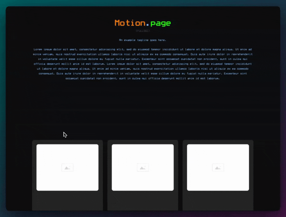
Now in here, what we can do is add our section. I will be showing you two ways to do this today. The first way is just using one section here, so 'Main Section.' I'm also going to give this an ID as well. So this will be 'MP Main Section.' I want to set this section to be 100% height or 100 viewport height. By default, I want to give it the main color that it's going to start with. I'm just going to go over here and select a color, so we'll start with a yellow color like this.
And then we'll go to pink, and then maybe green, but we'll do that in Motion Page. Now, what I'm going to do is just add some elements here, and I'm going to use the old-school Oxygen Ninja classes for this. First, I'm going to add a div. This div is going to contain all of our different texts, so I'm going to call this 'Text Wrapper.' And then in this text wrapper, I want to add some text. I'm just going to add some dummy text in here that I prepared.
Now, that's too long, so what I'm going to do is add a Max width to this main section, or sorry, the text wrapper, and let's do Max width 640, something like that. And then what I'm going to do is add another text; we'll need three. So this one, I'm just going to change the text slightly, so we'll add something like that just so we know it's different. And then, once again here, this is the final one; let's just change this to 'Second.'
Okay, now we want these to kind of overlap, so what we'll need to do is set this text wrapper to position relative, and then we can just leave one in place, and the other ones will need to be set to Absolute. So I'm going to leave the first one as it is, and I'm going to go to the second one here and just add 'Absolute' to that, and also 'Absolute' to this as well.
Okay, let's give these unique IDs as well because we'll need to control these in Motion Page. So I'm going to call this 'MP Text One,' and then, obviously, this is going to be 'Number Two,' 'Two,' and 'Three.' Now, by default, we don't want to see the second or the third one. So in here, I'm just going to do 'Effects Opacity 0,' and then we'll do the same for this one as well, 'Opacity 0' there, so we can only see the first one for now.
And then in Motion Page, obviously, we're going to control the different opacities as we scroll down. Next, what I want to do is just add some margin to the bottom of this, maybe like extra large. And then what I'm going to do now is add another div; this is going to be our columns. This needs to be outside of the text wrapper. This is going to be our columns. I'm also just going to rename these real quick and text three columns. Now, what I'm going to do for this one is I'm going to use columns two-one. I'm going to give this a gap as well of medium. And then let's add two more divs. So, this will be the left column, left duplicate. This is going to be right. All right, so we've got our left and right columns here. In the left column, I want to add my headings. So all I'm going to do is just go here, 'header one,' and I'm going to say 'event production,' for example. I want this to be uppercase. And I'm also going to add an Oxy Ninja class here, 'header one C,' 'header one,' just to make it a little bit bigger. I'm also going to change the ID once again so we can target this in Motion Page, 'MP Heading One.'
I'm going to duplicate this one; this is going to be, obviously, 'number two.' This one's going to be 'creation.' Duplicate this one more time, and then for this one, I'm just going to call it 'video and audio,' something like that. And, of course, we need to give this an ID as well, so 'MP Heading Three.'
All right, so what I'm going to do here by default is give these a text color of something dark. The dark color is going to be the one that's highlighting, and then I want to give these a different color, something a little bit lighter. And it looks like I've made a small error there. I forgot to add a hyphen there, so let's make this something like this and also the same here. Okay, cool.
Now, I don't need to overlap these because these are just going to change color as it goes down. And then what I want over here is three images. All right, so what I do want on this element is to make it relative because we do want to overlap the images using absolute. What I'm going to do first is just add my first image to this. So, image, image URL. I'm just going to choose something that kind of has a yellow background like this just so it matches the background. And then, don't forget to make this relative. I'm going to leave the first image as it is, 'image one.'
Duplicate that, 'image two.' Duplicate again, 'image three.'
Okay, so once again, we'll leave the first one in place, and then 'image two' we're going to make it, um, relative, sorry, absolute, same for 'image three,' absolute. So now they're overlapping each other. And then let's just change these images. So 'image two' is going to go to a pink background, so let's choose something like this. And then, this will have a green background or something like this; it will do, nice. Okay, cool.
So, I'm going to give this an ID because I want to target every image inside and just give them round borders. So what I'm going to do here for this 'MP Image Wrapper,' and then I'm just going to create a quick and quick CSS here, and then I want to target every image within this wrapper and then just add some radius. All right, so now every image will have this nice rounded corner. And for now, I think that's it.
I'm going to add a quick section underneath this just so that we have something that we can scroll to after the pinned is finished. And I'm also going to make this 100 viewport height. So let's save this and let's go to Motion Page now.
So, let's create a new timeline. We'll call this 'Pinning Demo,' and let's go to our new page here, 'Pinning Demo' that we just created in Oxygen. All right, so what we'll need is Scroll Trigger. We want to lock to the scrollbar. I'm going to use my preferred delay here, which is 0.2 seconds. For the pinned element, we want to select 'MP Pin Trigger.' Let me just make sure that's the correct ID. Sorry, it's 'Pin Trigger,' so I'm just going to copy that.
So, that's working, as you can see. Now, once again, we want this to start pinning at the very top. So we'll need to set the start viewport to zero, which puts it to the top there like so. And then I'm going to do minus 100, which, once again, you'll notice that the scrollbar got shorter. Minus 100 just means it's taking this height and doubling it. So we're going to scroll for the duration of this height.
And then let's add our first animation. So, first, let's control the section background here. So let's go like that, press enter. And then what we can do from... So, yellow is fine. To, we'll change the background color. I'm going to go over here and select my pink color, this one. So, as you can see, I'm scrolling down, and the background is changing quite nicely. But it's not quite perfect because what we want to do is we actually want to scroll a little bit first and keep the current settings. And then we want it to change quite suddenly. So what I'm going to do is, once we've scrolled to around one second mark, I'm going to change it quickly, like that.
Okay, we want all of the animations, the first animations, to happen at the same time, so the background's finished already. Next, let's bring in our next text element. So what I'm going to do is add a new animation node, put it in line, and I'm going to target our first text, which is 'MP Text One.' And then we want to fade it out. So press enter here.
Opacity from its current opacity to zero, and then that will disappear. Now, as you can see, but we also want to bring in our second text element. So what I'm going to do is add another animation node. We'll target, this time, 'MP Text Two,' and then remember in Oxygen, we set it to a default of opacity zero, but we want to bring it to an opacity of one. So you should see a slight change now to the second text, like that.
Next thing, what we want to do is change these colors here. So I'm going to target our headers, and for this, once again, create a new animation node. Just to make this easier, I'm going to use our scanner here. I'm going to scan this and select our ID. We want this to go to this gray, so we'll go to 'Text Color.' I'm going to use our Color Picker right here. We want to make it become this gray. And then, after that, we want this to become black. So once again, 'Text Color,' and then I'm going to target this black color here. So you can see those change like that. So it gives the effect that it's changing a slide.
And the last thing to do is change the image. So what I'm going to do for this in Oxygen is just going to make sure that these have IDs. They do. And also, another thing that's happening is 'Image Three' because this is on the bottom; it's actually showing up on top, which we don't want. So once again, like we did with the text over here, we'll need to set these opacity of zero, effects opacity. We'll do zero on this one and then opacity zero on this one as well. So, effects opacity zero, which will bring in our first image. We'll save that. Motion Page should refresh automatically like so.
And now let's change the images. So I'm going to add a new animation node. We'll target our first image. So that will be 'MP Image One,' enter. And then once again, opacity will become zero in this one. But at the same time, we're going to bring in 'Image Two.' 'Image Two,' opacity of one. Okay, so you can see the image is changing quite nicely there as well.
All right. Next thing I'm going to do is create our final transition. So what I'm going to do is just move this forward a little bit and I'm going to create some new animation nodes here. So once again, we will change the text first. So 'MP Text Two' needs to become zero, and then 'MP Text Three' needs to become one. Okay, so you can see the final text block is coming in there. And then once again, we will change the background as well. I should have done that first just to keep everything uniform, but that's okay. So we'll do this. We'll target just the background this time, the section. So 'MP Main Section,' we're going to change this to a nice green. So, background color, and I've just put it on my clipboard there. Make sure that's working. Yeah, it's almost like a turquoise, I guess.
Next, what we want to do is change this again. So let's put this around here. New animation node. I'm going to target, just using this, 'Heading Two.' Also, it becomes... not to opacity; we're changing the color here. So, 'Text Color,' is going to become, once again, a gray color. And then new animation node. We're going to use this one; this is going to become a darker color. So, 'To Text Color,' grab the dark color here. Okay, let's see if that's working. I do need to make these smaller, as you can see, so I'm just going to drag up my timeline like that. Perfect. And then the last thing to do, of course, is the image.
So let's bring it around here, animation node. We'll select 'MP Image Two,' opacity will become zero, and this one, three, to opacity of one. And then just make sure that these are here like that. Yeah, cool. So that's all working. Now you'll notice that on the last transition, we are unpinning a little bit too quick. Now, the way that I would it around that is I would just add a new animation node, which is a little bit further forward, like this. So the first is one second to two seconds. And then if we add this under around three seconds, what we can do is just target an image or anything really and just make sure that you add something that already exists. This is just the way I would do it. So, for example, the 'Video and Audio' text here, I'll select it, and we know that it's already transitioning to a dark color. But what I would do is just add that color again. Sorry, not on 'From,' it was to be on 'To,' for 'Opacity.'
We now get this nice transition, and it's remaining there because it needs to activate this node as well. Now this node is... It's the same as this node anyway.
Oh, sorry, that's the image. So it's the same as this node. So this node and this node are exactly the same, but because we put this one further forward, it just means we can remain within the pinned element for a little bit longer as we scroll. So I'm going to save the timeline; we'll take a look at this on the front.
Alright, so here's our section. It's, um, it's scrolling down a little bit there because of the, um, the admin bar, but I'm scrolling. Let's change to pink and then change to green, and then we unpin. So obviously, The Styling Is Not Great; this is just to show you an example of a nice animation effect that you could achieve. I'm sure you guys are going to create amazing designs better than this one, but that's the first way I would do this.
Now, what I'm going to do for now is show you the second way, which might be the preferred method. I think it's just easier to edit in Oxygen with the second method. So in Oxygen, what I'm going to do is the main section; I'm going to rename this to section one. And I'm also going to change the ID as well, so MP section one this time. And then all I'm going to do is duplicate this, three times, two, three.
Now, before I overlap them all, I'm going to make edits to them. So all I'm going to do is in section one, I want to delete text two and text three. This one's to be the same; that's fine. And then in the columns on the right side, we don't need image two or three anymore.
Then over here, what I'm going to do is section two. We also need to give this an ID, so MP section two, like that. We'll do the same here just before we forget, section three.
Okay, so for section two, what we'll need to do is delete text one and text three. And then, obviously, we'll need to remove the opacity that we added on this. Now, this text is like this because if you remember, we made the text, the second text, position absolute. So we'll just fix a few things here. Now, don't forget on text wrapper; we will need to, sorry, text wrapper, just remove relative. We don't really need that right now. And then on text two, we'll need to just get rid of that so that the class on the text wrapper, the max width is now taking effect as it should. We should also probably remove layouts on here as well. We don't need this anymore.
Okay, so that's that. Next, we can just control the different colors here now. So I'm going to change this to the DAC color here and then change this to the light color. We'll also change the background here, so the second color was pink. So let's grab this pink color, and we'll add it to our second section's background. And then the last thing to do here is we'll get rid of image one and image two. Now, once again, we will need to change the opacity here. Now, you'll notice that our body radius has disappeared; we'll fix that in a minute. But before that, we'll just make some small changes here as well. So section three, text wrapper, we'll remove relative; we'll remove text one and two. Text three, we'll get rid of the absolute position, that, and also get rid of the opacity over here. Change this, this darker color. And then once again, with the images, get rid of that and that, and then this one, get rid of the absolute position. Don't need relative on here anymore either, and then opacity, get rid of that. Just make sure that this is also not absolute. Don't need this either. And then the final thing to do is change the colored background here. Okay, cool.
So all we need to use for this now is the section IDs, really. We don't really need to use the IDs of these because they're already in place, as you can see. Now, I am just going to add a border radius to each image. So in my style sheets globals, I don't need this anymore; I can just add some classes to each image. C rounded like that, HE rounded, and CR M, okay. So the last thing for us to do is, um, is overlap these. So the easy thing to do is on your pinned trigger, is set this to relative, relative. And then we'll go to our other sections, absolute, and absolute this as well, so now they're all overlapping each other.
Now, just like we did with the text before, we'll need to do with the sections as well. So I'm going to make this opacity zero, and we'll do the same for this so that we can now see the first section like that. I'm going to save my changes here, and now let's go back to Motion Page.
So what we're going to do is clean this up. I'm going to delete all of these. Okay, we'll bring this down because this is going to be much shorter now. So what we're going to do this time is we're going to select our first section one, and what we need to do on this one is only control the opacity; we'll make it become zero. We'll add a new animation node, and we'll bring in section two. Opacity to one; don't need anything here. And then, once again, we'll go to two seconds, make this a short transition. Once again, this time we'll MP section two will hide it on two or so; we'll hide it like that. And then we'll bring in section three, so section three, opacity wants to become one. And then, once again, just to keep that scrolling on the last slide, we'll just add a similar animation node here; we'll just add the same one as this, right? So we'll do MP section three; we'll just do the same, so make sure it remains at one. So I've just done all that without testing, but let's see if it works.
So there's section two, section three; everything looks good. All right, and then there's the unpin. So this way, I think, is better. I wanted to show you the first example just in case you need to use that kind of technique for any kind of setup that you guys may have, but for this kind of um transition, I think this is the way to go. Once again, in Oxygen, it's it's just much easier to edit the sections. So you could, for example, just hide this one, and then obviously, you'd have to control the opacity. But I think it's just much easier to, um, you know, make edits instead of every element and images overlapping each other. I think it's a pretty cool effect.
So let's just test a new version here, so I'm going to scroll down; obviously, I need to save Motion Page. What's the Pink goes to Green turquoise, and then we unpin. Cool. I think, once again, The Styling Is Not Great; you could obviously Center a line all of this, make it look much prettier. But yeah, all in all, I think this works quite well. So I hope you liked this tutorial; it's nothing too special, but I do think it could be a very effective animation for your websites, especially if it's designed nicely. Uh, we will be back again next week with another video, and as always, if you liked it, please give it a thumbs up and consider subscribing if you're not already, and yeah, I'll see you next time. Thank you very much. [Music]