Create Simple but Effective Text Animations - GSAP/Motion.page - ScrollTrigger
Introduction
In this tutorial, Luke Allen demonstrates a simple but effective scrolling text effect in Oxygen Builder, inspired by a design seen on the GSP showcase website. The effect is straightforward yet enhances user engagement, and Luke guides viewers through replicating it in a simplified form, encouraging customization for better aesthetics.
Steps
Setting Up the Page in Oxygen Builder:
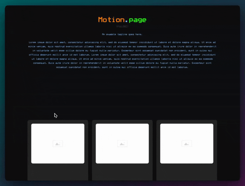
- Create a New Page: Start by creating a new page in Oxygen Builder, naming it "text animation."
- Add Buffer Sections: For ease of demonstration, add two buffer sections with 100 viewport heights to facilitate scrolling.
- Insert Main Content Section: Place the main content in the middle section, where the animation will be applied.
Configuring Text and Header:
- Add and Customize Header: Insert a header, using "Developer" as an example, and increase its size (20M) with additional letter spacing.
- Insert and Format Text: Add supporting text beneath the header, adjusting the size and width for visual appeal.
Creating the Scrolling Effect in Motion Page:
- Setup Trigger and Duplicate Section: Wrap the content in a div to serve as an animation trigger, then duplicate the section for variation.
- Configure Motion Page Timeline: In Motion Page, create a new timeline named "text animation" with a scroll trigger, locking it to the scrollbar.
- Adjust Animation Settings: Set animation zones (20% and 10%) and select the trigger for animation.
- Animate Header and Text: Apply animations to the header and text, adjusting letter spacing and color to create the desired effect.
Refining the Animation:
- Adjust Text Shadow and Opacity: Use text shadow for a border effect and fade the text in with changing opacity.
- Independent Animation for Sections: Enable individual animation for each section to ensure smooth transitions.
Conclusion
This tutorial effectively demonstrates how to create a subtle yet engaging scrolling text effect in Oxygen Builder using Motion Page. The process, broken down into manageable steps, allows for creative customization while maintaining simplicity. The result is an interactive design element that enhances the overall user experience on a website.
Video transcript
Hello guys, welcome back to the channel. My name is Luke, and I do apologize for the delay with the videos. Unfortunately, I was sick last week, and also we had some house renovations the week before. In any case, I am back, and this tutorial is going to be a very simple one. It's just going to be a basic scrolling effect with some text, and this is what it looks like. So, nothing too fancy, but it's a very simple, subtle thing. I did see this on a GSAP showcase website, and I thought I'd try to replicate it. Obviously, this is a much simpler version, but I'm sure you guys can style up your sections to make this look a lot better. But as far as the animation goes, it's quite simple, and I'm going to show you how to do this right now.
Okay, so first of all, what I'm going to do is just create a new page here in Oxygen Builder. I'm just going to call this text animation for convenience, publish, and then we will edit this in Oxygen Builder. Since we're going to be using the scroll trigger, what I like to do is create two buffer sections with 100 viewport height just so that we've got some room to scroll. So, I'm going to put those in right now. I'm just going to put this to 100 viewport height and then I'm going to duplicate this section so we have one underneath as well.
Next, I'm going to put my main section in the middle, that will be section number four here, and this is where I want to add all of the content. So first, what we need is a header, and just for the example, I'm going to write here "Developer." I also want to add some text underneath, so we'll add some text here, just some dummy text. Now, I'm going to make this text a little bit bigger using a utility class here, so text L will make it a little bit bigger. Then, I also want to limit the width of this text as well, so we'll do Max width of 50. Max width 50 there, okay, nice.
Next, I'm going to change the header here. I'm going to make it a little bit bigger, so instead of editing the ID, I could just add a class to this. So, we'll add a class here, we'll call this text animation header, and I'm going to make this 20 M like that. I do want it to go off the page like this because what we're going to do is we're going to control it and make it come in at the end. I also want to add some letter spacing to this of something like five viewport width, kind of spaced out like so. Going to save changes, just see what it looks like on the front here. So that looks pretty good. I do want to see it without the letter spacing as well, just to make sure that it does fit. So that does fit on my screen. You may need to play around with your sizes just so that it fits. You could also use different values like percentages so that it does always fit on all monitors, but just for demonstration purposes, I'm just going to use this for now.
One thing I don't like is the space here, and then it's obviously not lined up with the letters. So, I'm just going to indent this text a little bit, and I'm going to add a class to this text as well. So, we'll call this one text animation text, and then on here, I'm going to do a margin of 20 pixels like that. Okay, cool. So, what I'm going to do is just add the letter spacing back on this class, letter spacing, it was five viewport width, save. And the last thing I want to do is in Motion Page, if I have two sections, for example, with similar content, I want to trigger each iteration individually, and we can use the same trigger. So, what I'm going to do is simply wrap the content here in a trigger. We'll wrap it in a div, and we'll use this as a trigger. Make sure that everything is inside there. I'm just going to rename this so it's easier for me to understand. So, animation trigger, the class on here is text animation, so we'll do text animation trigger.
And now what we can do is duplicate this section and change some content, for example. So, I've just called this one animation for now, just as an example, and I'm going to save this. And now let's head over to Motion Page and add our animations. Okay, so I'm just going to create a new timeline here. I'm just going to call this text animation, select our newly created page, which is this one. And once again, this is going to be a scroll trigger. I do want to lock it to the scrollbar, and I think for this one, I do want to leave it at 1 second. I think that's fine. Now, I want this animation to take place around the top part here. So, what I'm going to do here is change this to around 20%, change this one to 10%. And here, we don't want to use the first element because we're going to use two elements here. We want to use a trigger to animate both of them at the same time. So, what I'm going to do is use selector and remember the name of our trigger. So, we'll go back to Oxygen, grab this class name, don't forget the full stop there, and we'll use the trigger here. And we also want to use the top as well on this one, and we'll do the same.
Okay, so that should now target our trigger that we created, the div. Alright, so what we want to do first is animate this heading here. So, I'm just going to use my scanner, select the header here, the class that we created. And what we want to do is we want to change the letter spacing. So, we'll go here, we'll go custom, letter spacing. Now, remember, originally we are using the viewport width, so we'll change it back to zero viewport width. So, you can see now both of those headings are coming back to zero viewport width, which is good, that's what we want. Now, another thing we want is to add kind of a border effect, and for that, I'm going to use a text shadow. And then also, we'll change the color to, we can do transparent, or we could just simply change it to the same color as the background, whatever works for you. So, I'm just going to add a new one here for custom, and I'm going to do text shadow. And I already have a value over here, so I'm just going to simply copy and paste it, but I will put this in the YouTube description so that you have access to it. Basically, it is a text shadow, but it's just using one pixel in each direction, so that it kind of looks like a stroke.
And the final thing we need to do is change the color. So, for the text color, I'm just going to try to match the background color here. So, I
'm going to select this, like that. So, it's pretty cool, we have a nice effect there. And the next thing I want to do, at the same time that this animates, I want this text to fade in. So, I'm just going to make a new animation node. I'm going to target our text here, which was text animation text, and then we want this to go from an opacity of zero to one. And that should animate at the same time. Now, as you can see now, the problem is obviously two sections are animating at the same time, and because we're using a single trigger, the simple fix for that is just to check this here. So now, they'll animate independently of one another, like so. So, I'm just going to save this and view on the front end. Refresh this page, so just scroll down, that comes into view like so.
Now, the stroke there, it's a little bit small, so I could simply change the values to two pixels instead. So, I'm going to do that right now. I'm just going to change all of these to two pixels, save this once again. Now, that is a little bit more severe, but let's just have a look on the front now. I think some displays will show this differently, but I think this looks much better now. There are other ways to do this, you could just use a stroke, an actual stroke, web kit stroke, but I thought I'd show you an example using shadow, text shadow for this effect. I think it looks pretty cool, actually. Once again, if the text does not fit, then just play around the values. You could use percentages so that it's always linear across each monitor. But yeah, it's a very simple tutorial, but I thought I'd just get something out there. But I will try to make up for my lost videos.
There you have it, guys. So, there you have it, guys, a simple tutorial today. Thank you once again for always checking out the tutorials on our YouTube Channel. Please don't forget to give it a like and do subscribe if you haven't already, and we will be back with another video very soon. Thank you.