Create a Scroll Progress Bar
Hello animators! 👋🏻
In this quick tutorial, we will be looking at 3 different ways in which you can create the currently-trending feature of a progress bar as you scroll. These are becoming popular on famous blog and news sites and chances are, you've probably seen them! Two of the methods we'll show you are quite similar to one another and quite conventional, but we will also show you a unique way of implementing this into your websites to add a bit of flavour! In fact, we will start with the more advanced version. Read on!
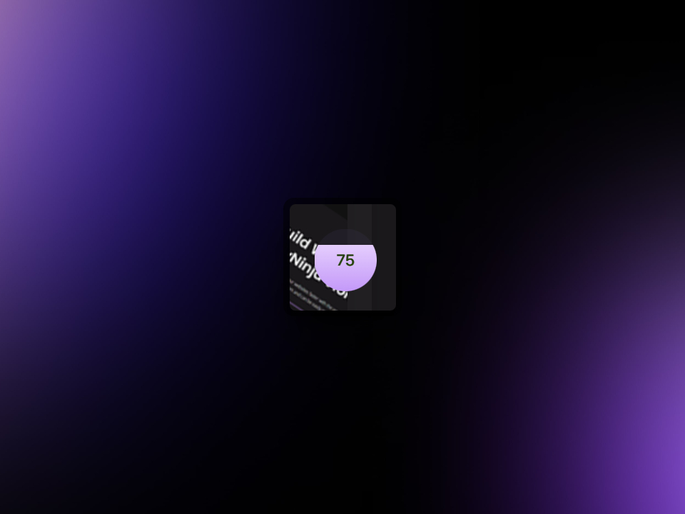
Circular Progress Bar
First, let's set up the necessary elements in the builder of your choice. In this example, we will be using Oxygen Builder, but we will show you the HTML markup so that you can gain an understanding of how to setup the elements should you be using other means to build your pages.
First, we will need a parent <div> with two elements inside of it, these two elements will be two more divs, but we will add text to the last one. Let's go ahead and add the number 100 to the last div, as this will represent 100% for when we have fully-scrolled the page. We will manipulate this later in Motion.page.
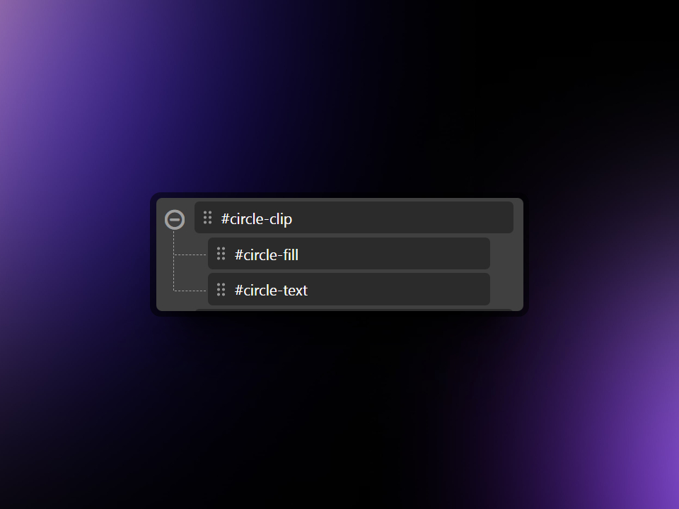
Here is how it looks in the Oxygen Builder structure pane:
HTML/CSS Markup
<div id="circle-clip">
  <div id="circle-fill"></div>
  <div id="circle-text">100</div>
</div>
Next, we will need to add some styling to these elements so that they are all set up properly ready for animating. For convenience, we will list the CSS styling below. You can add these styles to a CSS stylesheet, or add them individually to each element through the Oxygen interface:
#circle-clip {
    display: flex;
    flex-direction: column;
    text-align: center;
    align-items: center;
    justify-content: center;
    position: fixed;
    right: 16px;
    bottom: 16px;
    background-color: rgba(185,131,252,0.05);
    z-index: 50;
    width: 50px;
    height: 50px;
    clip-path: circle();
}
#circle-fill {
    background-image: linear-gradient(hsl(269,100%,90%),hsl(267,95%,75%));
    position: absolute;
    top: 50px;
    z-index: 50;
    width: 100%;
    height: 100%;
}
#circle-text {
    z-index: 100;
    color: #f9f9f9; /* This will not matter, but a value is necessary for mix-blend-mode to work */
    font-size: 12px;
    mix-blend-mode: difference;
}
Now we are ready to start animating this in Motion.page!
Motion.page Setup
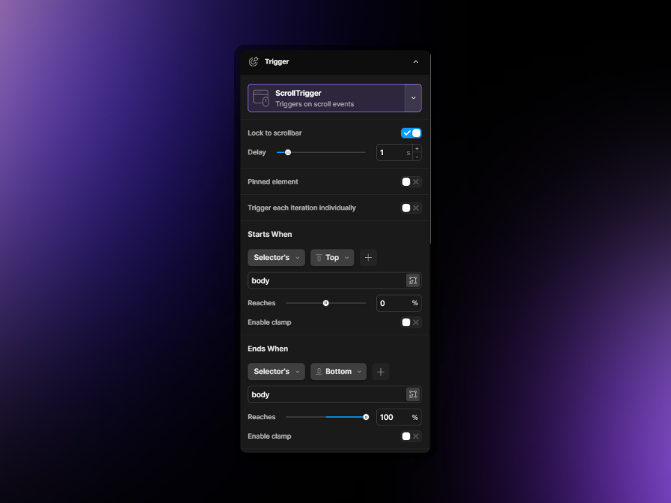
First of all, let's go ahead and open up Motion.page. We will create a new timeline and call this something appropriate, such as 'Progress Bar'. Now, let's follow these steps below to set up the timeline properly (we will also provide a screenshot below for convenience):
- Select the page where you created the elements previously, so that we can see the animation in action within the Motion.page builder.
- Be sure to click on the Globe icon as this will ensure that this animation will load on all pages wherever the #ID you're targeting is present.
- Next, let's set our trigger to ScrollTrigger since this animation needs to take place as the user is scrolling.
- Toggle 'Lock to Scrollbar' to on.
- In our example, we have set the Delay to be 1s. This creates a nice 'lagging' effect.
- The next thing we need to look at is the Starts When and Ends When sections. Since we want this animation to take place as the use scrolls the main body of the page, we can simply choose Starts When 'Selector's -> Top' and type body in the field. When the top of the body is at the top of the viewport, we want the animation to start. This means we can set "Reaches" to 0% - since 0% is the top of the viewport
- Now, in the Ends When area, we will choose Ends When 'Selector's -> Bottom' (bottom of the <body>) reaches 100% - since 100% is the bottom of the viewport.
Here is how your settings should look:
The next thing we need to do is set up our animation!
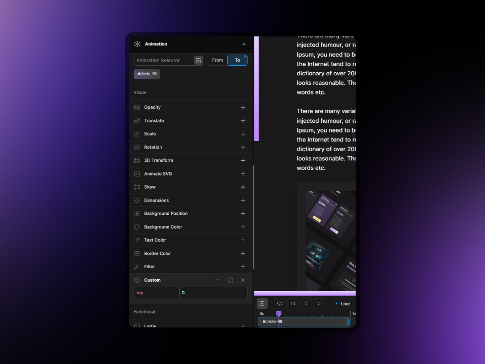
Let's create a new animation node by clicking the [+] icon on your timeline. In the Animation Selector, please type the name of the ID we created earlier for the fill. If you're following along with our setup, then this will be #circle-fill. Be sure to hit enter after you type in the Animation Selector field in order for it to register.
Since the element is already starting in the correct position, we do not need to change anything on the 'From' tab, but we will need to change to the 'To' tab, so make sure 'To' is highlighted.
Now, let's scroll down in the Animation section to the Custom tab, and in there, let's add 'top -> 0'. Below is an example on how this should look:
You should already start to see your circle animating as you scroll down! But there's another cool thing we need to do, which is animate the number!
Let's go ahead and add a new animation node by clicking the [+] icon on the timeline. Put the new node in line with the previous node so that they both start from the beginning.
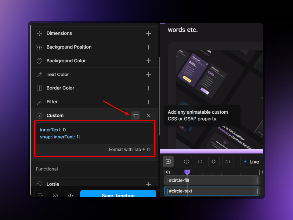
Now, we will need to use the Animation Selector once again to target our text element. You can use the scanner by clicking the button next to the input field, or simply type #circle-text in the input field and hit enter.
Remember, we set our text to 100, and this number represents the end of the timeline, so this time we will need to edit the animation on the 'From' tab. Make sure From is highlighted, and now we can go down to the Custom tab once again. This time, we will need to toggle the view so that we can add some GSAP (screenshot below).
In the box, we will add a short GSAP snippet.
GSAP Snippet
innerText: 0,
snap:{innerText: 1}
Here is a screenshot for convenience:
And now you will have your completed animation for the circular-style progress meter! You will also notice that the number will change color as the background fill goes up; this is because we set the text to have a mix-blend-mode of difference!
Vertical Progress Bar
We will now show you the set up to create a vertical-style progress bar. Let's go ahead and set up the elements.
We simply need one <div> which will be used for this, so go ahead and add a div to your page. In this example, we will give it an ID of #mp-vertical-bar.
HTML/CSS Markup
<div id="mp-verical-bar"></div>#mp-vertical-bar {
background-image: linear-gradient(hsl(269,100%,90%),hsl(267,95%,75%));
position: fixed;
left: 0px;
top: 0px;
width: 12px;
z-index: 50;
height: 0vh;
}Motion.page Setup
Once again, we're ready for animating! Go ahead and setup a new timeline and name this something appropriate. The timeline settings need to be the same as we set up in the previous section.
Let's add a new animation node by clicking on the [+] icon on the timeline. Then, let's add the name of the selector in the Animation Selector field. In this case, we can type #mp-vertical-scroll and hit enter.
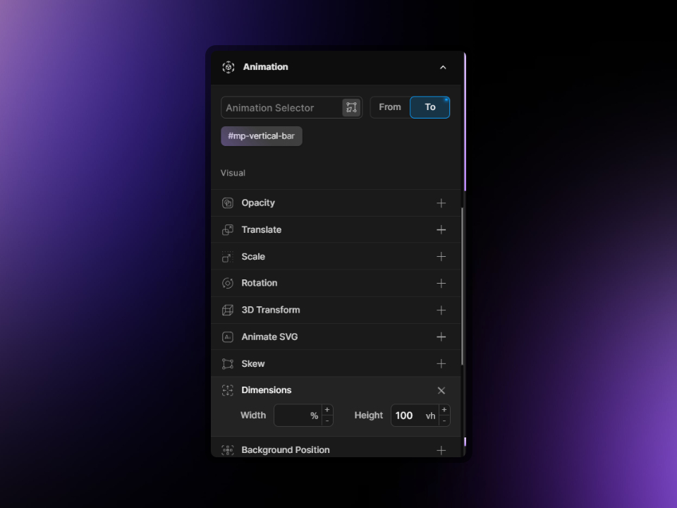
Since the element is already starting from 0vh, we do not need to edit anything in the 'From' tab. So let's choose to the 'To' tab instead, and then we can navigate to 'Dimensions' and add a height of 100vh.
Here is how this should look:
And that completes the vertical-style progress bar!
Horizontal Progress Bar
The final one is maybe the most popular out there currently, and that is the horizontal-style progress meter. It is very similar to how we set up the vertical one, but naturally we will need to play around with the positioning a little.
Once again, we will add a <div> to the page and give this an ID of #mp-horizontal-bar.
HTML/CSS Markup
<div id="mp-horizontal-bar"></div>#mp-horizontal-bar {
background-image: linear-gradient(hsl(269,100%,90%),hsl(267,95%,75%));
position: fixed;
left: 0px;
bottom: 0px;
z-index: 50;
width: 0vw;
height: 12px;
}Motion.page Setup
Let's go ahead and add a new timeline if you haven't already, and call this something that makes sense to you. Please follow the steps in the first section on how to set up the timeline, as this will use the same settings.
Now, we will add an animation node by clicking on the [+] sign on the timeline. We will need to select our element in the Animation Selector field by using the scanner, or simply typing in the ID name - in this case, #mp-horizontal-bar. Make sure to hit enter after typing in the name.
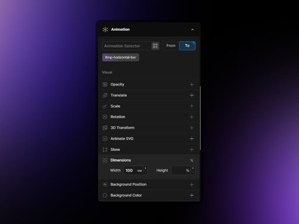
Once again, the element is already set up perfectly for the initial state, so we only need to make edits on the 'To' tab. Make to 'To' is highlighted, and then we can navigate to the Dimensions tab and add the following: Width -> 100vh. Here is an example:
Conclusion
There you have it! Three awesome ways in which you can add simple yet effective animations to your sites. In this case, we showed you the progress bars/meters which can be a useful visual indicator for where you currently are on the page.
We hope this was easy to follow along. Happy animating! 🙌🏻🎉