Creating a Scroll Progress Indicator - 3 Versions - Using Motion.page and GSAP 🔥
Introduction
Luke Allen's tutorial focuses on creating scroll-triggered progress indicators in Oxygen Builder using Motion.page. He demonstrates three styles: a unique circular progress bar with percentage text, a vertical bar, and a horizontal bar.
Steps
- Creating the Circular Progress Indicator:
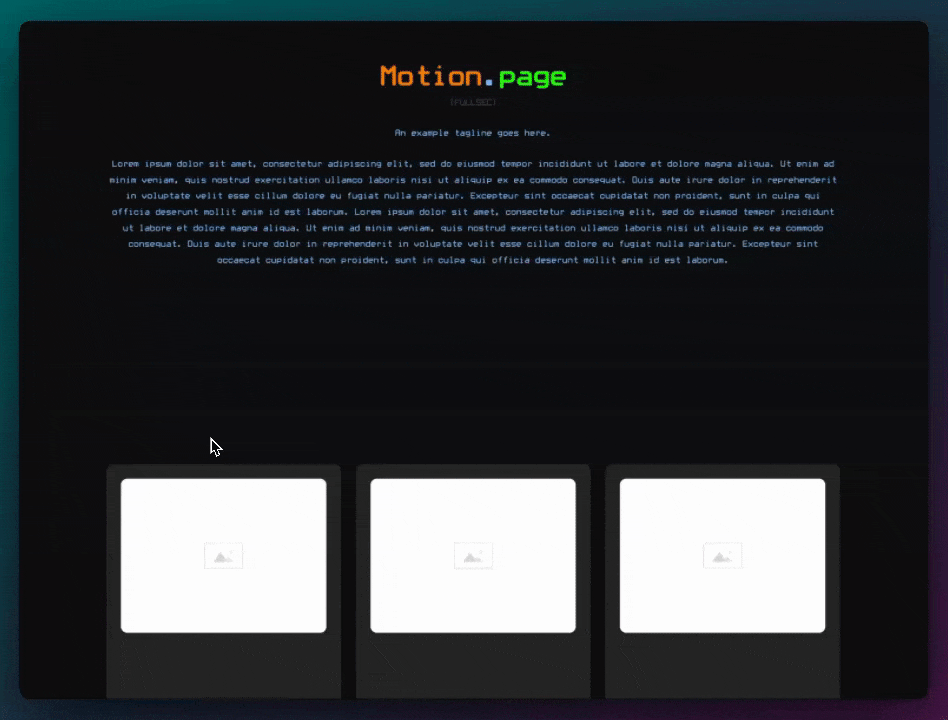
- Start with a new page in Oxygen Builder and add dummy content for scrolling.
- Add a div named 'Circle clip' at the top of the page, set to fixed positioning.
- Configure the div with a width and height of 50 pixels and a light background color.
- Use a clip path to shape the div into a circle.
- Inside the circle, add another div named 'Circle fill' for the progress bar.
- Set the 'Circle fill' div to absolute positioning and animate its top position from 50 pixels to 0 in Motion.page.
- Enhance the circle with a gradient background and add a text element inside, displaying '100'.
- Animate the text to change from 0 to 100 as the user scrolls.
- Creating the Vertical Progress Bar:
- Add a new div named 'horizontal scroll' (later corrected to 'vertical scroll').
- Set the div to fixed positioning on the left, with a height starting at 0.
- Apply a gradient background and animate the height from 0 to 100% of the viewport height in Motion.page.
- Creating the Horizontal Progress Bar:
- Duplicate the vertical bar and rename it for horizontal scrolling.
- Adjust the dimensions to a minimum height of 12 pixels and a starting width of 0.
- Position the bar at the bottom of the page.
- In Motion.page, animate the width from 0 to 100% of the viewport width as the user scrolls.
Conclusion
This tutorial offers a comprehensive guide on creating different styles of scroll-triggered progress indicators in Oxygen Builder. The circular progress bar with percentage text is a unique feature, while the vertical and horizontal bars provide a more traditional approach. These indicators are useful for blog pages or long content, visually indicating the user's progress through the page.
Video transcript
[Music] Hello, guys, welcome back to the channel. My name is Luke, and in today's video, I'm going to be showing you how to create a progress bar, kind of like a progress indicator. As you scroll down the page, you might have seen this with some blog websites where when you're scrolling down the page, there's a progress bar. Sometimes it's horizontal, sometimes it's vertical, but basically, it indicates where you are on the page. So as you get to the bottom of the page, the progress bar becomes full, and obviously, when you're at the top of the page, the progress bar is empty. I'm going to be showing you three examples today. Two examples are going to be pretty similar; it's just going to be a vertical bar and a horizontal bar. And then the third example is going to be kind of a unique version where it's kind of in the shape of a circle, and the circle fills up as you go down the page. But we'll also implement some text inside the circle, which shows the percentage of how much you scroll. And this will all be done using Motion Page.
So let me show you how we can create this. So I think we'll start first with the unique version with the circle since it's the hardest one, and then we'll finish up with the easier ones. All I've done here is in Oxygen Builder, I've just set up some dummy content just so that we have enough content to be able to scroll down the page like this. This could be a blog page or anything like that. So all I'm going to do first is I'm going to add an element right at the top. This is going to be a div, and put this to the top. It doesn't really matter because this is going to be positioned absolute anyway. And just to make my life easy, I'm going to rename this to Circle Clip. Like this, I'm going to give this a width and height. So I'm going to do min-width of 50 pixels and a min-height of 50 pixels as well. There will be an element going inside of this, so I just want to make sure that everything is aligned center. I'm actually going to position this, uh, I'm going to use fixed actually. I want this to be fixed, fixed in the same spot, uh, at the right side around 16 pixels and at the bottom 16 pixels. And just so I can see what I'm working with, I'm going to give this a background color, something very light, something like, uh, my primary color here, which is only 5% opacity. And I've just noticed I can't see anything, so just in case, I will change the Z-index as well in layout. So I'll just put this to 50, so now I can see it on top of everything, and that looks good so far.
What I need to do next is I'm actually going to use a clip path on here just so that this becomes a circle. So I'm going to go to Advanced and Custom CSS, and what I'm going to do in here is do clip path. I want to set this to be a circle, so just like this, and we have this div become a circle, which is perfect. Next, uh, inside here, I just want to add another div. So this div basically is going to act as the fill. So this div is going to start at the bottom, and as we scroll down the page in Motion Page, we're going to basically change its position from the bottom, and it's going to move up slightly. So this is going to use a different color, the primary color, and we want it to start right at the bottom there. So I'm just going to rename this to Circle Fill, something like that. I'm also going to give this an ID just so it's easier to target it later in Motion Page. I'm going to call this, uh, MP for Motion Page Circle Fill, like that. I'm going to give this a background color of our primary color. As you can see, that's filled up like that. And now we want to position this absolutely so that we can control the Top Value. So let's go here to layout, we'll go to Absolute, and we want to give the position top of 50 pixels because the, as you can see, the minimum width of our container is also 50. So that's just going to push it to the bottom slightly.
So with that done, uh, I think we can open up Motion Page and get the, uh, the fill to animate. First of all, so I'm going to save this for now, and I'm going to go ahead and open up Motion Page right here. All right, so I'm going to go ahead and create a new timeline. I'm going to rename my timeline here to Progress Bar, and I'm going to open up our page progress bar. Okay, we want this to be a scroll trigger because all the animations are going to take place as we scroll. I do want to lock it to the scroll bar. I'm going to leave the delay at 1 second for now because I do want it to kind of have a lagging effect. And then what we want to do is we actually want to use the, uh, the body element because the body is going to start around here, and the body finishes around here. So we want this to be using the page as the, uh, as the selector. So I'm going to go ahead and use selector, and I'm just going to type in body, and I'm going to do the same here as well. So body, and what we want to say is when the top of the body, so the top of the body is at zero, and we want this to finish when the bottom of the body, which will be here, reaches the end of the viewport at the bottom. So I'm going to change this value to 100, which will push that to the bottom like so. And now we can go ahead and animate.
So what I'm going to do is I'm going to use the ID that we gave, so that was MP Circle Fill, hit enter, so you can see it highlighting down there. Now the front position is fine; it's starting in the correct place already. So all I'm going to do is go to two, and remember, all we need to change on this is the top position from 50 to zero. So we'll go to custom, we'll type in here top, and when that reaches zero, uh, this of course needs to be pixels, pixels. And, uh, one last thing I forgot to do because I've just noticed this is not working here on the front, uh, in Oxygen, just make sure that you give the Circle Fill, uh, a minimum width and a minimum height. And I'm just going to use the same values as its parent here, the Circle Clip. All right, so let's just double-check that. Yeah, so let's go back here, and we can see in Motion Page that is animating. And once again, make sure that the, uh, the Top Value here on absolute is set to 50, so it's pushing itself down the whole height of 50 pixels.
So let's just have a look on the front here. We'll refresh this page, and we'll scroll down. So now, as you can see, we have this really nice effect. The circle is filling up there. So what I'm going to do in Oxygen is just improve this a little bit. So on the Circle Fill, instead of using the background here, I'm going to add a gradient. So I'll make it a little bit lighter on top, something like this. And just so I can see what's happening, put this to zero. So yeah, so I did want it to be light on top and dark on the bottom. So that's perfect. So once again, we'll try this in the front. Very cool. So we have the circle filling up here. The next thing I want to do is add some text inside there. So in Oxygen, I'm going to go here, I'm going to add some text, and all I'm going to do for this text is add the number 100. I'm going to make this text pretty small, so I'm just going to use a utility class here, text S, to make it very small. And let's just quickly see what this looks like on the front. So we have 100 in the middle. Unfortunately, it is being hidden by the, uh, the fill there. So just to make sure that doesn't happen, I'm going to go here to the text, and I'm just going to change the Z-index on this one as well to something like 100. Refresh, and now we can see that the 100 is always on top.
Another nice thing that we can do here is, is we could add some custom CSS, and we can use a mix blend mode and set this to difference. So that way, whatever the color is behind it, the text will change color accordingly, so that we can always see it. It's going to use a contrasting color. Um, but in order to do this, we do need to make sure that the text has a default color, and that can be any color, actually. So typography, I'll just use white as an example. I did make a typo here, as you can see, so we'll change that to mix, apply code, and now it should work. So you can see the text went dark there on the purple background, but you can see as it changes here, it will always be contrasting to whatever's behind it, the color. So a pretty cool effect there. And now all we need to do in Motion Page is animate this number. So let's go back to Motion Page here, uh, next, I'm just going to add a new animation node, and I'm going to target our text element over here, text block. And what we need to do for this is on the from, we can add some custom code here. So first, I'm going to do in a text, I'm going to set it to zero. Now remember, I'm on the from timeline, so we want the number to start from zero. I'm going to do comma, and then here, we want to do snap, and then we want to target the inner text, and we want it to snap by one, like this. So this should work on the front end. So now you can see the number is scrolling up there. And basically, what snap is doing is it's just rounding up the number. So if we don't have snap, so as you can see now, the, the number is, uh, it's really large without snap. So snap is kind of important. So I'm just going to re-add that, like so. We'll save the timeline, double-check that that's working once more. So yeah, there is the first example of a pretty cool progress indicator, um, on scroll.
Now the next two versions are going to be very simple. So let's go ahead and add those. The next one I'll add is the, the horizontal one. So let's go ahead and add a new div. I'll rename this one Horizontal Scroll. And now what I'm going to do, once again, is go to layout and go to fix. I want this to be at the left by zero. I want it to span from the top to the bottom like so. And then in size, all I'm going to do here is I'm just going to change the minimum width and max width here. So let's try something quite small, like six pixels. In fact, let's try something like 12. I think 12 looks a little bit better. Uh, once again, in layout, just in case, I want to change the Z-index to around 50, so it's always on top. And then actually, I'm going to remove the bottom zero because I want this height to start at zero. So let's go back here and size and spacing, uh, for the height, I'm going to put this to zero. And before I forget, let's just add a background. We'll also use a gradient once again. So I'll use a lighter color for the top and a darker primary color for the bottom. Now in Oxygen Builder, you can see it because Oxygen likes to add a default height and width to the elements. But on the front end, if I saved this, we shouldn't be able to see anything. Perfect. So now, once again, in Motion Page, I'm just going to use the same timeline for demonstration purposes. So I'm going to add a new animation node here, uh, this time I want to target our new progress bar. So it might be better to give this an ID. So let's call this MP Vertical Scroll. And I do apologize, it's not Horizontal Scroll yet, this one is vertical. So I'm just going to copy this ID, and in Motion Page, we can now target that with the animation selector, like so. Just make sure I do save Oxygen here. And now what I'm going to do is on the two, we want to change the height. So we'll go to dimensions, and then height, we'll do viewport height to 100. So you can see here in Motion Page, um, it is animating. Now I did just make sure that, um, the value here on height is viewport height zero. So I'm just going to go ahead and save this timeline, and then let's refresh this page here. So now you can see, once again, we have a vertical style progress bar, which is pretty cool. And then obviously, this is just exactly the same for horizontal as well. So all I'm going to do is is duplicate this one. I'll change this to a horizontal, and now we'll just go ahead and change some values. I'm going to change this to Horizontal Scroll, the ID. And then in size and spacing, all I'm going to do is change the min-height to 12, the max height is also going to be 12, and then the width of this is going to be zero, viewport width. I'm going to delete these values here. And now I just want to position this to the bottom. So all I'm going to do is here, change this bottom to zero, and that will put it to the bottom. We'll save this, and in Motion Page, once again, we'll add a new animation node. This time we want to target the horizontal scroll, and on two, this time we want to change the dimension of the width to 100 viewport width. So now when I scroll, you can see we also have a horizontal style. Save the timeline, refresh the page, and as you can see, they're all working together like this, which is pretty cool.
Now obviously, you might not want all three styles on the same page, but this is just an example, a demonstration on how you can achieve each one, and I think they're all pretty cool. So there you have it, guys, another nice tutorial. This is quite a popular feature I've seen on websites recently, especially on blog pages and things like that. I hope this was easy to follow along, and if you liked the video, please do give it a thumbs up and please do consider subscribing if you haven't already. And I'm looking forward to seeing you in the next video. Thank you. [Music]