Create a Cool Stacking Card Effect in Motion.page - Fast and Easy!
Introduction
Luke Allen presents a tutorial on creating a scroll-triggered stacking card animation in Oxygen Builder, inspired by a user request. The animation involves cards overlapping and moving off-screen as the user scrolls.
Steps
- Setting Up the Page:
- Create a new page named "Stacking Cards" in Oxygen Builder.
- Add a main section, naming it 'section pin', and set it to 100 viewport height.
- Inside the main section, add a div for two columns, naming it 'column'.
- Creating Columns and Cards:
- Add left and right columns within the div.
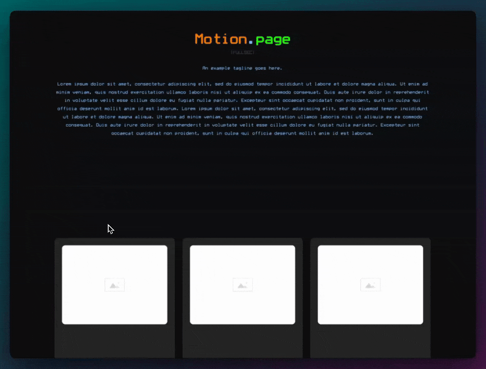
- In the right column, add a div for the card, naming it 'stacking card'.
- Set the card size to 250x250 pixels with a border radius of 30 pixels.
- Add a heading and text to the card, adjusting the layout to center align.
- Duplicating and Positioning Cards:
- Duplicate the card twice for a total of three cards.
- Make the cards overlap by setting them to absolute positioning.
- Adjust the rotation of each card (e.g., 20° and 40°) to create a staggered effect.
- Setting Up Animations in Motion.page:
- Open Motion.page and create a new timeline named 'stacking cards'.
- Set up a scroll trigger and pin the 'section pin'.
- Animate the top card (card three) to translate off-screen and rotate as the user scrolls.
- Animating the Remaining Cards:
- Animate the second card (card two) to straighten up (rotation to 0°) and then move off-screen.
- Repeat the process for the first card (card one), ensuring it follows the same pattern.
- Adjusting Animation Speed and Testing:
- Modify the animation speed and ensure no easing is applied for smoothness.
- Test the animation on both desktop and mobile, adjusting card sizes for responsiveness.
- Finalizing the Animation:
- Save the timeline and check the animation on the front end.
- Ensure the cards move and rotate smoothly as the user scrolls.
Conclusion
This tutorial effectively demonstrates how to create a scroll-triggered stacking card animation in Oxygen Builder using Motion.page. The animation adds a dynamic and visually appealing element to the webpage, with cards overlapping and moving off-screen in a staggered manner. The tutorial is suitable for users looking to enhance their website's interactivity and visual appeal.
Video transcript
[Music] Hello guys, welcome back to the channel. My name is Luke, and today I want to show you a quick tutorial. We recently had a request on our community page by a user called Teemo. I hope I'm pronouncing that correctly, and he was wondering if we could create a card animation which kind of looks like this. I'll put it on the screen right now, and he was wondering if anyone could make it in Motion Page. So it is possible, and in this video, I'm going to show you how you can achieve that.
Okay, guys, so as usual, I will be using Oxygen Builder for this. I'm also going to be using Coro Workor just to speed up my own process. So I've just created a page here called Stacking Cards because that's kind of what we're going to be creating today, and I'm just going to click here, edit with Oxygen, and we'll set up a basic page from scratch.
Okay, so what I'm going to do first is just create our main section that we'll be using here, and I'm just going to rename this to actually a section pin because we will be pinning this section as well. So we'll use this section as a pin element, and what I want to do with this section is make it 100 viewport height like that, and then inside here, I want to add a div. I'm going to use this div as two columns, so I'm going to call this column. I'm just going to add some utility classes here, so columns two. I want this to be full width as well. I'm going to add a gap in here of large, and for now, that's okay.
What I'm going to do now is add our left column and duplicate this. This will be our right column, so left and right like that. Next, what I want to do is just add some padding to this one, so padding L, and then I'm going to add a heading and some text within this. I want some gap as well, gap large, something like this. I'm going to change this to something like a header three, just add some Lorem Ipsum text here. Okay, now I want this to stretch, so I'm just going to add another utility class to our parent here, items stretch, and then in here, I'm going to add our little card.
So I want to center everything in here, so just to make this very quick, I'm just going to do it like this. Okay, and then let's add our div. This is going to be one of our cards. To make this easy, I'm going to add a class called stacking card without any typos. Now here, I can change the size. We'll do 250 by 250. I also want to add a body radius of around 30 pixels, something like that. Okay, next, what I'm going to do is add some padding to this, padding M, and then we'll add some text. So we'll add another heading. This way too big, so let's make that like a header four, header one, and then what I want to do is add some text as well. So we'll also, actually, we'll make this space between like this. We'll do two sentences of Lorem Ipsum. Maybe that's too much, so let's just add one like that.
Now on the ID, I want to change the background color here, something nice and light. Okay, I think that works. Call this our stacking card one. Now what I want to do is duplicate this, but the problem is we want them to overlap. So what we'll need to do is on here, we'll just make this relative. Now, in order to maintain its height, we want to keep one as it is like this, but then all of the other cards, we want to position them absolutely. I'm just going to add absolute here as a utility. That's overlapping now, and then whichever card here in the structure pane, whichever one is on the bottom, will show up on the top. Change this to a header two, and then we can also change the color of this one on the ID. This will make it kind of like this.
Now the reason we want to keep one without absolute, and I'll show you the reason if I go to mobile. Well, actually, first, let's just add a utility class here, so it's responsive. So we'll make this a single column on the medium breakpoint here. So if I add absolute to this one as well, you'll notice that it kind of loses its structure on its parent. So that's why we want to keep one without absolute, just so it keeps its height there. Anyway, let's continue.
So I'm just going to do three examples here, stacking card three. If you want to do more, then just follow along and just make sure that you change the values accordingly as I change them here. So stacking card three, we'll change this to a header three, and once again, we'll change the background color here to kind of like a greeny blue, like this, something like that. I think that works. Now remember, stacking card three is going to be on top. Now you could, if you want, change this to header. Actually, I think I'm going to do that. So I'm going to keep these labels the same here, but what I'm going to do for this is I'm going to change these. So header two, that's already correct, and then this one, instead, because it's underneath, the very bottom is going to display number three. So we kind of go in reverse order with the headings here, like that.
And then what we want to do, because this is going to be on top, we want it to maintain its current position like this, but then the one underneath, we want it to rotate just a little bit so we can see it underneath. So what I'm going to do is effect, transform, rotate, and let's do 20 degrees each time. If you have more than three cards, you might want to do 10 instead, just so it's more subtle. So I'm going to do 20 for this example, and then obviously, the one at the bottom wants to be 40, like that. So that's how I'm going to use my cards for now.
I also want to center-align everything in the section, so I'm just going to do this like that. Let's just check responsiveness, so we'll go here. Now I want to add a little bit more of a margin at the top there, so only on this breakpoint, I'm just going to add size, margin-top. I'm just going to use a variable here just to give it some breathing room there. I'm going to change the name of the ID on this section to section pin, like so, and I think that's pretty much it. So for now, I'm just going to save this, save, and then let's head on over to Motion Page, and I'll show you how we can achieve these stacking cards.
Okay, so I'm going to create a new timeline here. I'm just going to call this stacking cards. We'll target our new page that we created here, stacking cards. All right, what I want to do first, actually, sorry, guys, I want to add just a section at the bottom and a section at the top, just so we have some kind of buffer, and I change the height of these as well. So heights, let's do 50 viewport height, so it's not too big. Duplicate that one, put it to the bottom, delete this one, and just so we can see what's happening, I'm just going to change the background color slightly to this color, same on this one as well. Okay, save that, go back to Motion Page. It should refresh automatically, but it didn't, so we can just manually do it like this.
Okay, perfect. So what we want is, this is going to be a scroll trigger. Everything's going to be happening on a scroll. We want to lock it to the scrollbar. My favorite value to use here is 0.2. That's just personal preference. We also have a pinned element, and that's going to be our section here that we conveniently named section pin, and we want it to start when this section, when the top of it reaches zero, which is the top of the viewport there. You see the green line, so you can see it's pinning here. I'm scrolling here a little bit. It's in place, and we want it to finish when the top of the same element reaches minus 100%, which is the full height of itself. Okay, so that's perfect. That's pinning just how we want it.
So let's create our first animation. So what we want to happen first is this card on top. We want this to translate off the screen at the top there. So before we select the cards, I've just remembered as well, we don't have to, but it would be very convenient if we gave these IDs. So what I'm going to do is change the ID of this according to the labels here. So I'm going to call this card one, going to call this card two, card two, and then card three. Okay, I'm going to resave this. It's going to make it much easier to edit in Motion Page now.
Now you can see we've lost the colors because we just need to refresh. The IDs have changed. That's the reason. So now we can target this one, which is card three, the one on top. The FR property is fine. We'll just need to edit on the tool each time. We want to translate this on the Y axis, and I want this to go off the screen at the top on both desktop and mobile, so I'm going to use a value of minus 100 viewport height like this. So you can see when we pin it, it's going off the top of the screen there. If I also go to mobile, you can see that it does go off the screen quite nicely. So that works for my needs there, that's fine. So I'll go back to desktop here.
Now, I also want it to rotate slightly as it goes up. So what I'm going to do is add a rotation of minus 20. Now, the ones underneath have a positive value, but then when it goes off, I want it to go to the left side like that. Okay, now at the same time, what I want to happen is card 2, I want that to kind of rotate so it's standing straight, if you know what I mean. So I'm going to make this quite short, maybe half a second, 0.5. I'm going to target the card underneath, which is card 2, and then I want to add a rotation of zero. So we want to put it back to zero essentially from its current value of 20. So you can see that's going to zero there.
And then when this reaches its endpoint here, I want to add another animation node. So we'll target card 2 once again, and we just need to add the same values here. So we'll do card 2, translate minus 100 viewport height, rotation minus 20. And then all we need to do is just copy this structure one more time. So we'll add a new one there, that make this a half a second, but this time we'll target card one, which is underneath. Just make sure that's the correct name, yeah, card one. So card one, we want to bring it back to a rotation of zero from its current position, which is currently 40. And then once that's finished, we'll add another one for card one. Card one, translate it minus 100 viewport height, rotate minus 20 on the way out.
So if I go to the top here, I will set this to live. So let's test this. So we scroll down, that goes up, that goes up, that goes up. Now, that's a little bit fast. It's all happening, so this is just one click of my mouse wheel, which is actually very quick. So first, what we can do is just make sure that everything is set to none, so there's no easing on anything. It's the first thing I like to do when testing things with speed, make sure everything is set to none. And then what I want to do is I can change this value here to minus 200%, which just means all of the animation nodes are going to last a little bit longer. So you can see now that is much better, it's much more smooth, it's much slower. So I like that quite a lot.
Header, header two, header three. Yeah, I think the rotation of minus 20 on the way up is, so it's not too much, it's not too little. I kind of like that. So, but anyway, guys, there you have it. I'm going to save this timeline. I'm going to check this on the front, see what it looks like. Okay, so I'm going to scroll down here. Looks pretty good. All right, I'm also going to test this on mobile. So here it is on mobile display. Now, I do think those cards are a little bit too big on mobile, so what I'm going to do is just change those values on the class. Go to the class stacking card on this breakpoint. What I want to do is just change this, save that. Let's refresh this here. Yeah, much better, much smaller. Yeah, fantastic.
Okay, so I think that's pretty good. Here it is again on desktop. Nice. Okay, so there you have it, guys, just another basic tutorial today. Thanks for watching. So in our next video, what we're thinking about doing is taking a real website which exists and kind of recreating it in Motion Page. So if that sounds like something that you'd want, then let us know in the comments. It would help us to gauge how much interest there is in that. But in any case, we will be back next time with a tutorial regardless. Please subscribe and like the video if you haven't already, and we will see you in the next video. Thank you.