Creating a Stacking and Pinning Effect in Motion Page
Steps:
1. Setting Up the Hero Section:
- Create a new page titled "Life at Spotify".
- Add a hero section with a gradient background using two colors.
- Insert text and a button in the center of the hero section.
2. Creating the Tabs:
- As you scroll down, there should be a container with three tabs.
- Create a new div for the pinning effect and label it "tabs container-pin".
- Inside this div, create three individual tabs. Each tab should have a unique ID and class for styling.
- Set the background color, size, and border for each tab.
- Inside each tab, add a title section with a set height. This will be used to control the motion page.
3. Content for Each Tab:
- Add a div for the main content of each tab.
- Insert a title wrapper, an icon, and a main title.
- Add a heading and adjust its width, height, border, and typography.
- Insert content, such as images and text, into each tab.
4. Adjusting Tab Positions:
- Set the layout of the tabs to relative.
- Adjust the position of each tab using the "Translate Y" value. This will control how the tabs overlap and move up as you scroll.
5. Animating the Tabs in Motion Page:
- Create a new timeline in Motion Page.
- Set the scroll trigger and adjust the delay.
- Target each tab and set the animation for its movement using the "Translate Y" value.
6. Adding the Final Section:
- Add a new section below the tabs.
- Adjust the margin to eliminate any gaps.
- Add content to this section, such as pricing details.
7. Finalizing the Animation:
- Return to Motion Page and adjust the offsets and triggers for the animation.
- Test the animation to ensure it works smoothly.
Conclusion:
Creating advanced animations can be complex, but with a clear understanding of how each element interacts, you can achieve impressive results. This stacking and pinning effect is a great way to enhance user experience on a webpage. Remember to always test your animations to ensure they work as intended. Thanks for joining this tutorial, and stay tuned for more from Motion Page!
Video transcript
Hello guys, Luke here with Motion Page once again today I would like to show you how to create something like this. This was actually requested through our tickets asking if we could create something similar. Now this is using a stacking effect but it's also stacking mixed with a pinning element. So let me show you what we're going to create today. So as I scroll down, you can see we have three tabs there and once they all come into view, it pins and then the first tab goes up to the top and then the second one goes up to the top like so, which is really cool. And then you go down and you get this effect and so on. So the main focus for today's video I think is going to be these three tabs and then I will also show you how to continue to the next section. It does get a little bit confusing because the way I do this today is I add this section inside of the pin so we have to add some values to compensate for the offset. It sounds confusing but you'll see what I mean in the video. But less rambling and let's get straight into this.
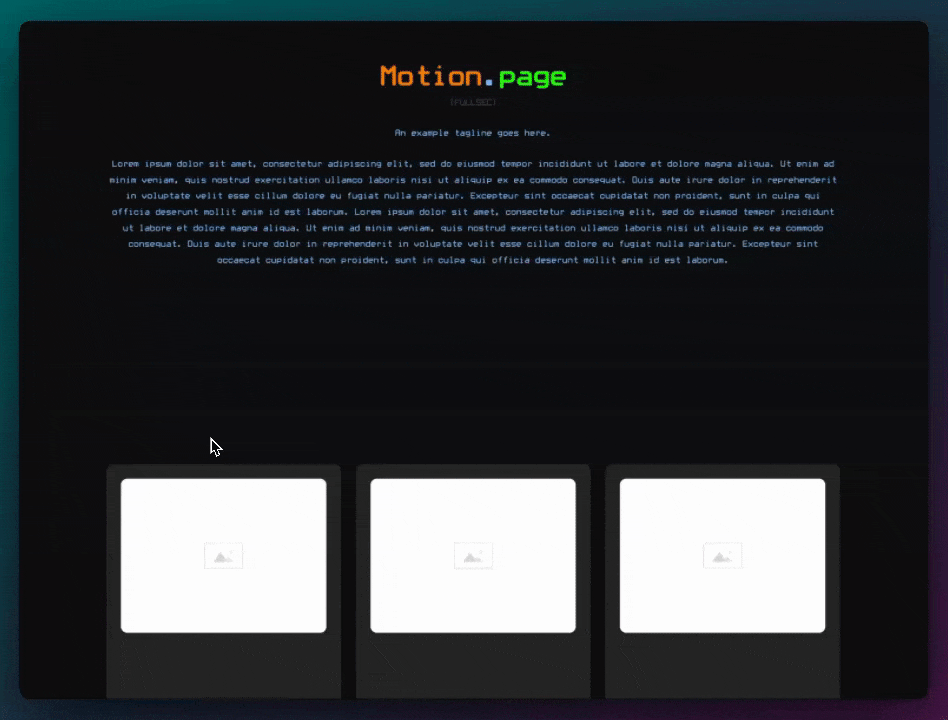
Okay, so I've just gone ahead and set up a page called Life at Spotify and I've just opened this in Oxygen already. So first, let's create our hero section. So all I'm going to do for that is use a section. I'll change the size here to 100 viewport height and give this a background. Actually, let's use a gradient, so two colors, and I'm just going to grab the colors over here using my Color Picker tool. Okay, and then next, let's just add some text here and then I'm going to add a button as well, all in the center, and edit my plus over here. Foreign this to Hero. I like to be organized here. Cool, so that's it for the hero. So what I want to do next is as we scroll down, we want to have a container which contains three of our tabs and I also want this to pin. So what I'm going to do for that is create a new div which we'll use as our pin. So make sure this is all outside. So I'm going to call this tabs-container-hyphen-pin just so it's easy for me to see what's going on here. I'm also going to change the ID of this to tabs-pin so we can target this easily in Motion Page. And then inside this, we want to create our actual tabs. So I'm going to go ahead here and add another div and call this tab one. I'm also going to change the ID of this as well, once again to tab one. I want to make sure this is a full width, so I'm just going to add a utility class here, full width. I'm going to add another unique class called MP-tab, Motion Page Tab, and we'll apply this to every tab just so we can apply some styling to this which will be used across all three. And in here, let's just do a background of this color. I also want to control the size in here, so this is going to be a height of 100 viewport height and also a minimum height as well. I want to also give the tabs a border, so and the border is going to be a little bit darker. Let's just do this for now, see what it looks like, solid, and also on the top left, I want to give these individual radii, 20 pixels each.
So inside of tab 1, what I want to do is I want to add a kind of a title section and give it a set height so that we can use this set height in Motion Page to control everything. So what I'm going to do is inside here, I'm going to add another div. It's going to be called title with a set height. Now once again, I want to give this a full width, see fluids like that. I will add some padding here, so I'm going to do padding S on the ID. I just want to make sure everything is middle aligned, so everything's kind of in the center here. And then the most important part is here, height. I want to give it 120, and I'm also going to set it to the max height as well. I don't want it to ever go beyond that. Under there, I'm going to add another div, and this is going to be our main content for the tab. Once again, full width, whoops, full width, and then I'm just going to let the height be auto. But for now, let's go back here. I'm going to add another div which is going to be kind of our wrapper, so title wrapper. And in here, this was to be set horizontal, middle line, center, and then we're going to add an icon and then the main title in this. So in here, let's add a heading for this. I'm just going to do one. I want to give this a set width and height of 50 pixels because what I'm going to do is I'm going to add a border to this. So let's also make sure this is center aligned like that, and then borders, let's just use the dark color here, width of one pixel, solid, border radius fifty percent, typography, font weight 600, and then line height, I'm going to change this to 1.3 just so it kind of sits more in the middle like that. Next, I'm going to add another, so let's just make sure we've got a small gap on here, XS, Who We Are, let's dot dot. And I think that's going to be it for my title section here. So I'm going to save this and then let's go down to Content.
And now let's add some content to this tab. Now just to make sure that everything is kind of in line, I still want my padding here which comes with sections, so I'm just going to add a section to this like so. And then within my section, I'm going to add a grid. So let's just do div, and I'm going to use the utility class of C-columns, one two Gap M. I also want to stretch everything, so now you'll see if I add a div and duplicate that div, and if I had a height to this div, for example, 350, you'll see that this one also stretches along with it. So in this one, I wanted to add an image, so let's add an image. I'm going to use this one from the Spotify website, and then all I'm going to do to this is just add some rounded borders like that, nothing too crazy. So I'm going to call this left, I'm going to call this grids, and call this right. Okay, then in the right section, I just want to make sure that everything, once again, is middle aligned. I also want to add some spacing between the header and the text, so let's do owl m, and then all I'm going to do is add a heading. It's going to be Who We Are. I'm going to add some text here. I'm going to change the size of this, so text Excel. Also, I want to make that a little bit thinner, so maybe 400, and then I'm going to add this button over here. Once again, so now I'm going to duplicate this tab, call this tab 2. And this is not desirable, what we want to happen is we want this to kind of overlap right on our pin. We first of all need to go to layout and make sure it's set to relative. Okay, so once that's set to relative, tab one is actually, it's already in the perfect position. What I want to happen is Tab 2, I want to control this on the div. I actually need to change this ID to Tab 2, and then in here, on layouts, we want to make this absolute, so it's kind of overlapping now, but we want to control this from the top. So remember our title, we gave this a set height of 120 pixels, which means we can use that value to push it down 120, so it just starts on this line here. So that's what I'm going to do, and as you can see, it's pushed that down. So if I just rename this to number two, Where We Belong, and then we can do the same once again when we duplicate this one, we'll tab three, layout, and we'll just double this value once again to 240. Excuse me, number three, How We Act.
So I've noticed one thing, the border is not so pronounced, so I'm just going to try and change that. And I've just noticed also that the background itself on the tabs is not white enough for me, so I'm just going to change this to pure white. Okay, I'm going to save this, see what it looks like on the front. Okay, it looks pretty good. Cool, so what I'm going to do now is try to edit these in Motion Page and let's see what we can do. Motion Page, okay, so I'm going to create a new timeline here, and this is going to be called Life at Spotify. And let's open up our newly created page here. So once again, all of this wants to happen, the animations want to take place when we scroll. So let's go here to scroll trigger, lock to scroll bar, the delay, I'm going to turn down to 0.2. We do have a pinned element, let's just go grab that ID, so that's this one here, tabs pin. So make sure we select that. Now we want this to start, if you remember, we have three tabs, each size from the get-go is going to be 120 each, so 120 times 3, we need to offset our start trigger here. So what we'll do is when the pin element's top reaches a hundred percent, now that's going to put this to the bottom, which we don't want, we want to offset this by 360 pixels. So what we can do is click on this icon here, we can add an offset, use pixels, and add 360. Now this is working well, you can see that it started to pin here, but what I've noticed is we do have an issue with the hero section here. So I'm going to go back to Oxygen, and we're going to need to make sure that this is fixed. So just make sure this is a fixed element, and now what we can do is on this pin, layout in this box here, just make sure we push it down by a hundred viewport height. So now we get this effect going on. Okay, so make sure that's saved. All right, that's perfect. So as you can see now, I'm scrolling down, it's going to start pinning using our offsets by 360 pixels, which is the total of these three sizes combined. And then what we can do is add some animations for each tab.
Okay, before that though, we want to make sure this is also set to pin element's top, and then give this a negative value. I'm going to use minus 200 percent just for now, we can always change this later if we want to make it slower or faster. So what I'm going to target first is our first tab, so we call our first tab tab-hyphen-one, as you can see that's highlighting there. First of all, what we want to happen is we don't want to change anything on the from, the starting position is perfect, but two, once this is pinning, we want to control just the first tab's location, basically the translate on the y-axis, we want to move it up essentially. So I'm going to go to custom, I'm going to use transform, and for the value, I'm going to do Translate Y, and I want this to move up a hundred viewport height. But you'll notice a small problem here because it's already starting, it's starting here. So if this position is zero, then it's going to do minus 100 from that position, which obviously we don't want. So what we're going to need to do is use a calc in here. So Translate Y, and then I'm going to do calc, this also wants to be in parentheses like this, it's going to be minus 100 viewport height minus, and then we need to grab the total of this, and we know that's going to be 120 times 3, so 360 pixels. And obviously, this wants to be plus, sorry, not minus. Now you can see we're having a slight issue here. Now what I've done already is I've put this to None instead of default, and also what I'm going to need to do is up here where it says add spacing, I'm going to change this to padding, and that will allow it to go to the top properly. And then all we need to do is just duplicate this, and instead of targeting tab one this time, we'll do tab two. So now you can see the tab here is actually stopping right at the top, which is where we want it, and they're all going to follow along if they've got the same value here, they're all going to maintain their original, you know, the original positions here except they're just going to move up instead. And then for this one, same again, duplicate, and all I'm going to do is target tab number three.
Okay, so that's basically what we want right there. Now that is a little bit fast for my liking, so I think all I'm going to do is just change this to minus 300, just so it scrolls through them a little bit slower, like that. I'm going to save this timeline, I'm just going to see what this looks like on the front. So I'm scrolling down, you see the pin happening here, that stops right at the top perfectly, now it is under the admin bar. Great, that's perfect. Next, let's add another section. Now the section underneath this, I'm actually going to add to the pin element here, so add section, I'm just going to call this final section. Now what I'm going to do for this, I'm just going to give this a background color, so you can see what's happening. Now in Oxygen Builder, this looks absolutely fine because the elements obviously, they've not translated yet on the y-axis, but you'll see on the front, we might have a small issue here. Now if I go back to the top, refresh, you'll see that we have a huge gap here. Now that's because all of these elements have translated on the y-axis, producing this gap here. So all we'll need to do is on this section, now because this is a section, I can't actually change the margin in here, so I'm just going to go to the custom CSS, and I'll add it in here. So margin-top, and I'm going to do minus 400 pixels, just to see what that looks like on the front end. So you can see that's pretty close, we just have like a one-pixel gap in there, so I'm just going to change that to 401. And then we can manipulate this section as well, so once again, height 100 viewport height, and then I think that's pretty much it, we'll just add a couple of elements in there.
So in here, I'm just going to add some basic elements from Oxy Ninja, so I'm just going to go to the library here and select something that I like. Okay, so I've just added this basic section here, it's just a pricing thing, and I thought we could use this in our final example, just make sure it looks good on the front. Perfect, so once again, let's head back over to Motion Page, and I think what I'm going to do for this is instead of using the triggers that we've got here, the best thing to do to use new triggers is just set up a new timeline. So that's what I'm going to do here, so I'm just going to do, I'm going to rename this one actually to tabs, because that's basically what we're doing there. I'm going to add a new timeline, it's also going to be Life at Spotify, and I'm going to do price for this one. Okay, cool, this also wants to be a scroll trigger animation. Now what I'm going to do for this one is lock to scroll bar, delay same again 0.2, this is not going to be a pinned element this time, so no need to worry about that. And then the start and end viewport, I just want to bring them a little bit closer together, maybe around the center kind of, so let's do 75, 125, something like that. I'll change this to the top as well, and what I want to happen on this page is I just want to control the background color. So it's not going to be Tab 3, this is going to be, let's see, so I'm just going to target this ID here, press enter, and then from its current color, and then let's do background color, and we'll just grab kind of a nice blue, royal blue. And then also, let's control this text color here as well, so let's add a new node, and then this time, I'm going to target this text. It looks okay here, but on here, I want this to change to white. So let's go ahead and use our scanner here, text block, this one, two, text color, and let's just do white. I think I'm also going to change this one to white as well, so I'm going to duplicate this one, and this time target this headline, and then let's light as well. So save timeline, I was going to see what this looks like on the front, hopefully we get a nice transition at the end there. So here's our tabs, who we are, where we belong, scroll down, and that did not work.
Alright, so what's happening here, guys, after a little trial and error, what's happening is our first original pinned element, if you remember, we are starting it on this one minus 300 percent, so we also need to offset this by around 300. So if I do 300, it's still gonna start a little bit too early, as you can see there. So if you add another 100 to allow for the viewport, 400 percent, then what we'll get is, it should start just in time there. So if I save this and then have a look on the front, the offset should allow it to work properly, like that. So that is what we want. So what I'm going to do is, I'm just going to change this text once again. Alright, so save timeline. So as you can see, once you start making these a little bit more advanced animations, it does get a little bit complicated. So let's just have a quick look here, and scroll up. Who We Are, the unpins now, remember the pinned element, now it's already minus 300 percent, the unpinning takes place at minus three hundred percent, right? So then we want to change this one, the offset to minus 400, so that everything kind of lines up. And the reason that's happening is because in Oxygen, this final section is within, it's inside of this pin, so that's why we need to compensate with the offset there. So hopefully that's not too confusing, but as you can see, you can create really nice animations like this once you know how everything's working. Okay, looks pretty good. So there you have it, guys, thank you once again for joining us for this tutorial. This one is a little bit more complicated, but once you understand how everything works, it is easy to see and understand why things are working the way they are. Now I will be back once again next week with another tutorial, so please stick around, please do subscribe and like this video. We always appreciate your kind YouTube comments, so thanks for those, and yeah, we'll see you next week. Thank you very much. [Music].