Create Epic Text Animations in WordPress Using Motion.page
Introduction
This tutorial demonstrates how to create animated text with a bouncing effect and an underline that fades in from left to right using Oxygen Builder. The process involves using split text, stagger, and custom CSS classes.
Steps
- Setting Up in Oxygen Builder:
- Create a new page in Oxygen Builder.
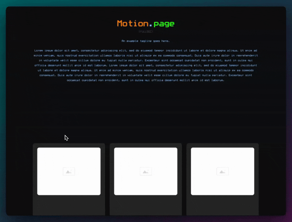
- Add a section and a heading (changed to header two).
- Center the heading and add some placeholder text (Lorem Ipsum).
- Creating Span and Adding Class for Animation:
- Convert part of the text into a span.
- Add a class (named 'MP bounce') to this span for targeting in Motion Page.
- Animating the Text in Motion Page:
- Create a new timeline in Motion Page named 'bounce effect'.
- Ensure the timeline is reusable across different pages.
- Select the 'MP bounce' class and apply split text characters and stagger with a duration of one second.
- Adjust the animation speed by changing the duration to a total of one second.
- Applying Overflow Hidden:
- Back in Oxygen, apply 'overflow hidden' to the parent class to create a masking effect.
- Changing Ease to Elastic:
- Modify the ease setting to 'elastic' for a more pronounced bounce effect.
- Creating and Animating the Underline:
- Create a new class in Oxygen (named 'MP line') and add custom CSS for the underline.
- Use a linear gradient for the underline, initially set to transparent.
- In Motion Page, create a new animation node for the underline.
- Target the 'MP line' class and animate the background size from 0% to 100% to create the fading effect.
- Final Adjustments:
- Adjust the color of the text to match the underline.
- Align the underline with the text by modifying the line height in Oxygen.
- Optionally, adjust the color of the line and text using gradients and webkit clip text.
Conclusion
The tutorial provides a clear guide on creating a bouncing text effect and an animated underline using Oxygen Builder and Motion Page. The use of custom classes and CSS, along with specific settings in Motion Page, allows for a dynamic and visually appealing effect. The tutorial is suitable for users familiar with Oxygen Builder looking to enhance their web design with animated text features.
Video transcript
Hey guys, Luke here with Motion.page just here with a quick tutorial on how you can achieve something like this. Just a very simple effect. For this, we're using split text and stagger, and we're also applying two classes that we can use and target globally. One class is used to control the letters bouncing up and down, and then another class is used just to apply this underlined effect. So, enough talking, and let's get into the video.
Okay, so I'm going to be using Oxygen Builder for this. I'm just going to make a quick page here. I'm going to give my page a name, publish, and edit with Oxygen. Next, I'm just going to add some elements to the page. We'll start with a section. I'm going to add a heading. I want to change this to a header two. I'm going to center my heading here and I'm going to add some Lorem Ipsum text. Okay, next, I'm gonna make this a span. And next, what I want to do is add a class to this that we can use in Motion Page to target. I'm going to call it MP bounce. We want to save this page and see what it looks like in Motion Page, but for this animation, let's create a new timeline. I'm going to call this timeline something like bounce effect. I'm going to select our page here so we can see what's going on.
Okay, so here's the page that we've just created. Another important step here is, if we want to reuse this timeline on different pages, which is what we maybe wanted to do, then we'll need to make sure that this one here is selected. So, just make sure that's selected there. Next, we'll select our class, which we just created, which was MP bounce, and make sure you press enter here. So, if I hover over this class now, you should see this highlight like so. So, what we want to do for the bounce, this is just for the characters here, so we'll do split text characters and we'll also stagger. Let's do one second. And nothing will happen yet, so what we'll need to do is just apply some effect so we can see what's happening. So now, as you can see, every second, each character goes up, but obviously, that's way too long. So, what we need to do is just click on each, and this will turn to amount, and what that means is from the start to the finish, it'll take one second in total. Now, okay, cool. So, what we'll need to do back in Oxygen, we'll just need to target the parent class here and just make sure that you apply overflow hidden, and this will give it kind of a like a mask effect in Motion Page over here. So, as you can see now, it's coming above this invisible line. Another thing, what I want to do is, I want to change the ease to elastic, just so it gives it more of a bounce effect, like so.
So, next, what we want to do is create our line, which is going to fade in from left to right. So, back over in Oxygen, let's create a new class. So, we'll create a new class here called MP line. And on MP line, I'm just going to add some custom CSS. Okay, so here's the CSS that I've just added. And what this is doing is, as you can see, we have a black line. Now, this is using a linear gradient, but also, what you cannot see is there's actually another line, which is also black. So, I just did two black lines, so we can actually see what's going on. But what we'll need to do, as you can see, linear gradient to right, black, black, we can change this one to transparent. So, now that these are transparent, obviously, on the front, we don't see a line initially, but we're going to use Motion Page to control the position using the property background size, and it's going to appear that the line's coming in from the left. So, let's go back to Motion Page. So, you can only see there's a block line there. I'm not sure where that's happening, but that shouldn't be. Yeah, so this is the front, this is what the front end looks like. In any case, let's just continue. So, what we need to do for this is, we just need to create a new animation node. Since the timeline is going to be the same, I'm going to put this in line with the bounce, and then we're going to target our new class here, MP line. So, as you can see, that's also highlighting the text there, which is good. Now, all we need to do for MP line is just go to the two, and then we'll do a custom property, and we'll do background size. And for this, we need to do zero percent. We actually need the percent sign here; otherwise, this will not work. Two pixels in height, and then we'll do a hundred percent, and once again, two pixels in height. So, as you can see, we have the line fading in now, which is perfect. Now, just to make this a little bit more linear, you can see it's a little bit faster than the text, so we'll just make sure that the easing is set to none.
Foreign. All right, I'm going to save the timeline here, refresh the front. That looks pretty good. I'm just gonna change the color of this text to a little bit of a darker color, so it's more in line with the underline there. So, I'm just going to do that on the bound, select a darker color. Cool. So, if I inspect this now, as you can see, we do have a small issue here. So, the line is not actually in line. So, we'll just do that real quick on the MP line. I've just realized MP line's on the parent. This needs to be on the span. And then in the custom CSS, we'll just add a display: inline. Cool, alright, let's go back to the motion page.
So, as you can see, we have a slight issue here, which is the line is kind of, uh, the characters are coming in from just below the line. To fix this, which is quite difficult because the span we created here is displayed inline, which means we will not be able to control the margin top and bottom. So, what we can do on the parent is make a line height which is matching the, uh, the span. So, what I'm going to do in typography is just going to give this a line height of around 1.25. The headings become smaller to kind of match the span that's inside of it. So, back in the motion page, so this is already refreshed, as you can see, but that line looks much better now. See what that looks like on the front, so that looks good on mobile and then also full width.
Perfect, optional guys, but the reason I use the custom CSS the way I did on the line is if you wanted to change colors, for example, on here. So, if you want the line to go red and blue, we'll save that, save, refresh. So, you can even control the color of the line with the gradient, and then obviously, you could do that with the text as well, using WebKit's clip text and using transparency with the background. That's also an option if you wish to do that. But I'm just going to change this back to black here. But yeah, there you have it, guys, just a very simple tutorial. I hope that's helpful. Please subscribe for more. We will be releasing more videos like this in the near future. So, thank you very much, and I'll see you next time. Thank you.